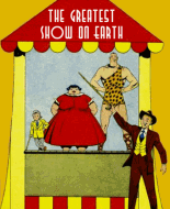
I can't get a good magnification to see the lettering in detail, but it looks like it's in lower case. While Quality Comics (using the Eisner-Iger Studio) had lower case lettering in their captions (a vey nice style that I would very much like to copy), even their classic comics had all caps lettering for the dialogue balloons, as did most other publishers. And I think caps work a lot better for balloons because they have a uniform height which makes them fit better in a balloon.
When I've done my own amature comics, I've preferred to use hand lettering for the most part. I do this by lettering on blue line paper, using a Sharpie for a nice thick line. I then scan these lettered pages as B&W images into my computer and I then cut and paste them onto the art that I've also scanned into my computer.
It's not the most efficient way to do it, but it works for me and you can make slight corrections to get the lettering to look how you want it.
 Author
Topic: Samples of my golden age/silver age inspired comic (Read 3305 times)


