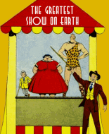
When readers pick up a new comic for the first time, the cover is often their very first gateway into an unfamiliar universe. Before a single panel is read, the artwork, colors, and overall mood silently communicate what kind of journey awaits. This initial encounter can spark curiosity, excitement or even an emotional connection that draws readers in instantly. That’s why first impressions matter so much in the world of comics.
A strong cover doesn’t just look good it tells a story. It hints at the tone, the stakes, and the characters without giving everything away. Whether it’s a lone hero standing against a ruined city or a vibrant ensemble bursting with energy, the visual language sets expectations. Readers subconsciously decide if the universe feels epic dark playful or mysterious within seconds. In forums like this, it’s interesting to see how often people remember a series not just for its plot but for the moment they first saw its cover on a shelf or online.
This is where
Comic Book Cover Design plays a crucial role. It’s not only about technical skill, but about understanding symbolism composition and audience psychology. A well designed cover can make a brand new universe feel established and important even if it’s issue #1. On the flip side a weak or confusing cover can cause a great story to be overlooked entirely.
I’ve noticed that some of the most successful universes use consistent visual themes early on. Repeated color palettes iconic character poses or recognizable logos help readers feel grounded. Over time these elements become visual shorthand for the universe itself.
In the end Comic Book Cover Design isn’t just marketing it’s world building. Those first impressions can shape how we perceive an entire saga before we ever turn the page. I’d love to hear which covers gave you that instant feeling of discovering something epic.


 Author
Topic: First Impressions of Epic Universes (Read 62 times)
Author
Topic: First Impressions of Epic Universes (Read 62 times)
