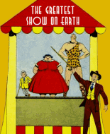
Marvelous Dick Giordano cover, and I might have guessed Nicholas/Alascia! A tribute, I think, to Dick's ability to adapt to interior-art styles. I love the Bill Molno art in this one, though it's Bill at his most minimalist. I think there's much to be appreciated in art which tells a story effectively by the quickest and simplest means, but obviously many fans disagree. It's my observation that many, if not most, fans prefer elaborately stylized art--and Molno's efforts were quite often quite the reverse! The meteor showers in "Man Alone" are my favorite kind of space art, and the Moon-like planet surface in "The Enemy" is very skillfully managed--again, with an economy of means. And the simple but cynical message is well conveyed via the tactic of showing two combatants, and then (at the end of the struggle) only one. The Nicholas/Alascia art is more or less figurative, while Molno's is concerned with mood.
Link to the comment:
Mysteries of Unexplored Worlds 39
 Author
Topic: Re: Mysteries of Unexplored Worlds 39 (Read 90 times)
