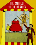
As narfstar remarked, this is a good-looking comic. Printing and color are much better than that of most later comic books. The art is generally good; most of the stories are not.
Of course as soon as I saw the inside front cover I thought, "Heck with these cute comics, introduce me to South Seas Girl and Captain Cutlass' female sidekick." But back to the subject at hand...the big feature, "Bobby." is pleasant though very little-kiddy. I realize Cap'n Patch's rocking chair is supposed to form a framing story for an imaginary adventure, but until the last panel we get the impression the adventure is really happening. Iger's artwork isn't spectacular, but it's nice and the good coloring helps.
The first thing I thought seeing "Zingo the Zooper Zebra" was My Little Pony. The kid looks like he came from the MLP universe. The story is pretty blah. Willie the Wizard is a paradoxical character. Visually he's a typical 30s stereotype native but he speaks normal English. Perhaps the writer didn't picture him as an African? Overall the artwork is pretty good.
The remaining features are nothing special. "Poor Papa" has decent art but the payoff of the story is weak. "Hugh Dunnit" is a terrible mess, although the artist experiments with creative layouts. This feature would work better as an animated cartoon (though the story wouldn't be any better). "Freddy Fieldmouse" has a 60s underground comics look. "Fish Fables" is just plain weird. "Fatt and Lean," "Pell and Mell," and "Corn Belt" are bad. As for "Classroom Boners," I remember having a few of those myself. "Peter Pupp" has a certain charm (due mostly to the giant robot) although the art is a bit crude. I know Bob Kane created Pupp; is this his work?
Final analysis: Good artwork, great coloring and production, poor stories. 7 out of 10.
 Author
Topic: Week 105 - Bobby Comics #1 (Read 2472 times)
