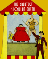
Avon made good (re)use of paperback cover art to "class up" their comic books. It makes this one look a whole lot better than it turns out to be.
The inside cover features another of Everett Kinstler's fantastic pen montages. Far and away the best part of the book. I love ERK's inside covers.
"Mae Crandall:" I like Joe Kubert art from this period. It's interesting to see the Caniff/Robbins influences which faded as Kubert's style developed. Joe does a solid job throughout. His weak spot is the lead character. Mae's huge, close-set eyes make her look somewhat alien. However she certainly looks evil, which fits her role. The story is typical crime fare. It's refreshing to see one of the gang at least tries to go straight.
"Louie Gruber" doesn't convince me. His dominion of the underworld seems to rise from his staging lots of simultaneous crimes. It seems to me this trick would only work a couple of times before the authorities figured out ways to predict forthcoming jobs. It bothers me that though Louie supposedly controls the whole city, his gang never seems to number more than half a dozen men. Mort Lawrence's art also bothers me. I have always felt I ought to like his art but I don't. He seems a competent draughtsman, but his grotesque faces and exaggerated posing--a sort of weird mixture of Graham Ingels and Bernie Krigstein--come off more sloppy than stylish. It's odd that the one character who cries out for exaggeration, Louie himself ("a mountainous hulk of flesh") is drawn very conservatively.
"Unseen Murderer" tries but fails because there's only one suspect. The nephew seems to transform rather suddenly from a gosh-wow kid into a drunken slacker willing to murder his uncle for an inheritance. Howard Larsen's art is just serviceable. He seems to have lost heart without a busty woman to draw.
"Leech McCoy" is a routine true-crime-ish story. The most interesting part is Gerald McCann's art. In general I like McCann despite his limitations. He drew well and had a knack for character actors. He never lost the dark, scratchy inking style of the pulp magazines. Consequently indifferent printing frequently made his comics work muddy and hard to read. I think he would have looked much better in black and white. One thing about McCann was his almost infuriating consistency. Year after year, he never got better, he never got worse. He never changed style or experimented, and he steadfastly refused to move the camera closer than a medium shot. As comic tastes changed his work seemed increasingly old-fashioned. I last remember seeing him in Len Cole's Dell ghost comics from the 60s. Did he work beyond that?
I was struck by ad from The Institute of Applied Science questioning whether I have what it takes to look like Boston Blackie. I'd love to see their "qualification questionnaire." I envision tough questions like, "Do you approve of crime (Yes/No)?" and "How much money do you have?" If I did measure up, I'd want my first assignment to be taking down the fraudsters offering engagement rings for $1.74 apiece.
I read the text stories this time. On the day the victim of "Death Dance the Samba" expired I was one week and one day old. I had to laugh at how Castillo "died like a dancer." Witnesses say "he took four mincing, bumpy little steps." That sort of talk is usually reserved for a homosexual, but we're assured Cippy was an avid skirt-chaser. I guess he just feeled like dancin'.
"The Mystery of the Headless Corpse" had two odd features. One, that upon finding a mutilated body the police immediately thought it might be a practical joke by medical students (!!). The other, that no one seems to have thought of using the victim's fingerprints to determine her identity. True, in 1939 most fingerprints on file were those of convicted felons; nevertheless they could have searched for the victim's prints in their suspect's home.
Overall rating: Fair enough, with a nod to Kinstler and Kubert.
 Author
Topic: Week 108 - Police Lineup #3 (Read 3000 times)
