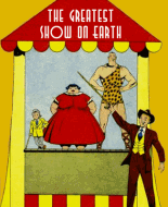
I certainly have a different reaction to this book from other readers. At first I was dazzled by the great art: Williamson, Morrow, Torres, Tuska, Orlando. If I'd stopped there I'd have given the book a 10. Once I read it I had a change of heart.
Let's start with the stories. Bad enough that there's so much text that the old British comics I grouse about read like Hemingway in comparison. Several seem like meandering first drafts. They're loaded with irrelevant detail. Though short, they strain so hard to reach the "surprise" ending that they seem to run on forever.
Take "Burn" for example. How many times in four pages must the manic cop yell "He's got to burn"? Why is the killer an eight-foot, 300-pound monster whom the cops know on sight? I love how the sane cop tells Mac "you hunted him down" when actually the pair just happen to see Jojo meander by on the street and chase him. I get the impression this story started out as something entirely different and new text was slapped on in an effort to make it eerie.
"The Unbeliever" at least has an interesting premise, though again it simply repeats the same situation several times before delivering its punchline.
The magazine's biggest problem is abysmal production. It must have been thrown together overnight. Some of the stories are cut up from art intended for newsstand-size comics. The tip-off is the awkward layout with lots of white space and huge, ugly black filler images. Even stories apparently drawn for this publication suffer. The text is trimmed too tightly, placed poorly and applied sloppily. Nothing is consistent. One story has a hand-lettered title, a couple have large typeset titles, and the rest have tiny typeset titles that look like afterthoughts. The point size of the dialogue varies from story to story, or even within a single story. Then there's that text feature. It ends in mid-stream with "Continued next issue" scrawled after the final paragraph. Obviously the editor wound up with three empty pages and filled them with a story he had lying around. So what if the story was four pages long?
Need proof how little care Joe Simon put into this mess? Check out the second balloon in panel 3, page 14. I quote: "...Let the Queen prove she is not a vampire! Queen stands erect and King angrily defends her." Yes, the writer's instruction to the artist has been lettered into the dialogue!
Though the presence of artists like Williamson seems to presage the Warren black-and-whites, in overall feel Eerie Tales is more like those Myron Fass shlockers.
Two final questions. (1) How can ugly Hulda walk in public (page 43 panel 4) without someone noticing her head is on backward? (2) Are we to understand that after the departed are gender-segregated into separate graveyards, the corpses rise every night so they can hook up? At least that is an unusual story premise.
 Author
Topic: Week 117 - Hastings Associates - Eerie Tales (Read 2630 times)


