in house dollar bill thumbnail
 Total: 42,820 books
 New: 187 books


small login logo

Please enter your details to login and enjoy all the fun of the fair!

Not a member? Join us here. Everything is FREE and ALWAYS will be.

Forgotten your login details? No problem, you can get your password back here.

Professor H's Wayback Machine

Pages: 1 ... 7 8 [9] 10 11 ... 30

topic icon Author Topic: Professor H's Wayback Machine  (Read 159478 times)

profh0011

  • Global Moderator
message icon
Re: Professor H's Wayback Machine
« Reply #200 on: September 21, 2013, 03:04:41 AM »

The latest restoration...

FANTASTIC FOUR #17 / August 1963 / Jack Kirby & Dick Ayers

If memory serves, this was adapted as the 2ND Dr. Doom story on the 1967 Hanna-Barbera F.F. cartoon show, and certainly the most far-reaching, as this is the one with Doom's hovering fortress in the clouds, where he attempts to bring the entire United Nations to their knees!

http://2.bp.blogspot.com/-VycUKt0xC-0/Uj0KUB9YyXI/AAAAAAAAPNI/B2RFDKpxXcE/s1600/FF+017_cc_BP_HK.jpg
ip icon Logged

profh0011

  • Global Moderator
message icon
Re: Professor H's Wayback Machine
« Reply #201 on: September 23, 2013, 03:21:02 PM »

The latest restoration...

FANTASTIC FOUR #18 / September 1963 / Jack Kirby & Paul Reinman

The entire left edge had to be "filled in", also, a lot of color registration problems (most noticable around Reed & Sue), and a ton of color drop-outs on The Thing and in the logo area.

This was the 1st of the 2 SKRULL stories adapted for the 1967 Hanna-Barbera cartoons. As with The Mole Man, very odd they should choose to do the sequel and skip the original story-- although they wound up using the ending of the original as the ending for the cartoon. (Go figure.)

http://4.bp.blogspot.com/-fWg2MHel6E0/UkBaOTI-aTI/AAAAAAAAPRo/UWqvPxuE48s/s1600/FF+018_cc_BP_HK.jpg
ip icon Logged

profh0011

  • Global Moderator
message icon
Re: Professor H's Wayback Machine
« Reply #202 on: September 25, 2013, 10:21:16 PM »

Just finished the latest restoration...

FANTASTIC FOUR ANNUAL #1 / September 1963 / Jack Kirby & Dick Ayers

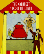
http://2.bp.blogspot.com/-zvds4mZKElw/UkNej1HhcOI/AAAAAAAAPTM/kzcSyUwDXe8/s1600/FF+A01_cc_HA_HK.jpg

This was a horrific mess to clean up, dirt, drop-outs, color specs and color registration problems everywhere. Plus, the scan I found was SO dark, I had to clean up the whites, yellows, reds, greens, grays, dark blues & skin tones separately. Namor's skin tones had "specs" all over the place, it took an hour or more just to clean up that area alone. Some of the dark blue-- including in the logo and other lettering-- was so dark, I had to do a major "color balance" adjustment before I could be SURE it wasn't just black.

Now, I ask you... WHAT kind of person decides to make the logo lettering RED, BLACK & BLUE??? (with yellow trim)

Further-- check out the red text box, with no less then 6 lines of text. (6 !!!) Did Sol Brodsky screw this up, or was that Stan's fault? I'm talking about how it was pasted down in place so that the right edge EXACTLY hits the tip of Namor's crown, AND the heads of one of the background figures. This is a "design problem" that could easily have been fixed by moving the box 1/4" to the left. These are working professionals, who got PAID to do a job this bad???

Oh, while I was at it, I noticed none of the background figures actually HAD any skin tones-- so I colored them in myself (pale blue). I know, hard to see, but trust me, it's there, now.

I almost forgot to mention the area at the bottom.  Bad, BAD, BAD!!! "design"... and once again, an "editor" who just doesn't know when to shut up and let the art work for him.

Meanwhile, after having REPLACED the entire pale blue background (it was very dirty, inconsistent, AND had specs all over the place), I STILL didn't like it.  But, as I'd done something I hadn't done in years-- generate an entirely NEW background, copy the art ON TOP of it, then REMOVE ("clear") the entire old background so it would show through FROM BEHIND... it was easy to then create an ALTERNATE background while I was at it.  Behold...

http://4.bp.blogspot.com/-jaD3hmpk-Z0/UkNex-a74JI/AAAAAAAAPTQ/SRZHEwCr4kg/s1600/FF+A01_cd_HA_HK.jpg

Now, they LOOK underwater!

STILL not perfect, but a major improvement.
« Last Edit: September 25, 2013, 10:24:02 PM by profh0011 »
ip icon Logged

profh0011

  • Global Moderator
message icon
Re: Professor H's Wayback Machine
« Reply #203 on: September 26, 2013, 03:55:24 AM »

I have a question.  For the last couple weeks, I have been running into the WEIRDEST glitch on my blogs.  I find that I can upload 2 IDENTICAL files, and they show up looking different.  Sometimes I'll remove one version of an image with an updated one, and inexplicably, the new one will be MUCH darker, even though in other programs (Photoshop, Super JPG viewer) it looks the same.  I've even uploaded the IDENTICAL file onto 2 different pages of the blog, and they look very different.  HOW CAN THIS BE?  What the hell is going on?

It's getting so I can't even trust uploading an image to look at to doible-check what it "really" looks like anymore...
ip icon Logged

profh0011

  • Global Moderator
message icon
Re: Professor H's Wayback Machine
« Reply #204 on: September 26, 2013, 01:14:38 PM »

Last night I set up a new "Sub-Mariner" page which would collect all his early-60's cover appearances.  On a regular website (like Nick Simon's Silver Age Marvel, which has been down for 2-1/2 years), you'd have ONE version of any file, and it could appear anyplace you wanted when you wrote the code.  But with Blogger, as far as I know, you have to upload more than one copy of something to get it to appear on more than one page.  I'm wondering if somehow, this might be connected.

Right now, for example, FF #9 and DD #7 look perfectly fine on their respective pages, but on the Subby page, both are way too dark-- which is especially noticable in the graytones.  The B&W newspaper image on DD #7, the one on the Subby page you can barely see the picture.

Now I KNOW I'm not imagining things.  I just downloaded BOTH DD #7 images back to my computer (re-naming them as I did so I'd know which page I grabbed them from).  And they're NOT the same!  And yet, they were when I uploaded them.

Oddly enough, the middle of the image is almost the same, but all around the edges, it gets progressively darker as you move toward the outside.  Totally bizarre!
ip icon Logged

profh0011

  • Global Moderator
message icon
Re: Professor H's Wayback Machine
« Reply #205 on: September 28, 2013, 04:10:19 PM »

The latest restoration...

FANTASTIC FOUR #19 / October 1963 / Jack Kirby & Paul Reinman

http://1.bp.blogspot.com/-w9Hiba8t7_w/Ukb7rdCOCNI/AAAAAAAAPZo/yXVYEMIu1As/s1600/FF+019_cc_BP_HK.jpg

You would not believe how nightmarish the color plate registration problem was on this. It's one thing when you're dealing with flat color (airbrush) but when 90% of it is dot patterns it requires extensive, tedius copy-and-paste-into to clean it up. In addition, there were creases all down the left edge, and some GASH ripped out of part of the logo. After that, adjusting skin tones & purples on separate layers was comparitively easy, as was cranking up the reds & middle blues. All done now!

I have to say, going in really deep and close to work on a thing like this, in my opinion, Paul Reinman was a REALLY LOUSY inker. He was not only sloppy, but his excessive use of thin lines robs a piece like this of any sense of depth, and also makes it much harder for me to do a clean-up. Give me Dick Ayers any day.  And to think, I was looking forward to this one...

"RAMA-TUT" was one of the classics adapted for the 1967 Hanna-Barbera F.F. show. The main change was eliminating Alicia, and substituting a search for a cure for Ben for a cure for her blindness.
ip icon Logged

jimmm kelly

  • VIP
message icon
Re: Professor H's Wayback Machine
« Reply #206 on: September 29, 2013, 12:14:38 AM »

I was at the UBC library the other day, going through microfilm of newspapers to see if I could find some comics. Didn't have as much luck as I hoped and it takes a lot of time to load and hand crank those reels of microfilm--so I didn't have the time to look at as much as I wanted to--but I did briefly look at the Batman strip. And I realized that the strip in fact did start at the right time (end of May '66) in our newspaper. So my memory of missing some weeks must be wrong.

I'll have to go back and look at more microfilm when I have a chance, because there's some stuff I wanted to look at and photocopy that I didn't have time for this time.
ip icon Logged

profh0011

  • Global Moderator
message icon
Re: Professor H's Wayback Machine
« Reply #207 on: September 29, 2013, 10:28:07 AM »

Steve Thompson was kind enough to supply me with the 1st and last of the Catwoman episodes.  I never saw the 1st one, but I have a strong feeling I have the last one... somewhere.  I cut all the dailies out, but only ever glued down the 1st story. So if the box with the others ever turns up, I'll probably scan in a new one and get a higher-resolution version put up.

The problem-- I'm sure-- is, even if they do show up (don't know where they vanished to, but it's that way with things decades old), is that I'm also pretty sure I DON'T have the end of the Penguin story.  Can't remember ever reading it.  And from accounts I've read just recently, it seems a lot of papers dropped the strip within the first 6 months!  Outrageous.  Well, THE COURIER-POST loved to drop adventure strips all the time-- and ALWAYS, in the MIDDLE of a story.  The comics editor must have been a real bastard.
ip icon Logged

jimmm kelly

  • VIP
message icon
Re: Professor H's Wayback Machine
« Reply #208 on: September 29, 2013, 02:29:24 PM »

I believe our paper kept the Sunday BATMAN going for about a year, maybe a bit less. They got rid of the daily strip earlier than that. But I'll have to look at the microfilm again.

One thing that disappointed me is that when I went back to earlier microfilms (before '66), those didn't include the Sunday funnies section of the paper, so I couldn't look at the funnies I remembered reading from before then.
ip icon Logged

profh0011

  • Global Moderator
message icon
Re: Professor H's Wayback Machine
« Reply #209 on: October 02, 2013, 03:36:24 AM »

The latest restoration...

FANTASTIC FOUR #20 / November 1963 / Jack Kirby & George Roussos

http://2.bp.blogspot.com/-6iLqH8HaTFY/UkuTn7QJTMI/AAAAAAAAPak/qa1cR9iWWEU/s1600/FF+020_cc_BP_HK.jpg

Another nightmarish clean-up.  In addition to "George Bell" inks making this look sub-par no matter what I do to it, the printer-engraver did a HORRIBLE job with Stan Goldberg's coloring work, resulting in color plate registration problems almost everywhere.  Not only that, but half of the "white" in Reed's hair was skin-colored. The thing was so far off-rotation, I had to do extensive "copy-and-paste-into" to fill in ALL 4 EDGES this time, adjust the dark blues, green and skin tones on separate layers, use an endless amount of airbrush to clean up the entire logo and the flashy text box, among other things.  I also had to outright copy the corner box faces of Ben & Sue from an earlier cover!

This is the first 21 F.F. covers in a row all done now.  I really need to take a break from these and switch off to something else...
« Last Edit: October 02, 2013, 03:40:12 AM by profh0011 »
ip icon Logged

profh0011

  • Global Moderator
message icon
Re: Professor H's Wayback Machine
« Reply #210 on: October 19, 2013, 03:59:55 AM »

The latest restoration...

STRANGE TALES #106  /  March 1963  /  Jack Kirby & Dick Ayers

http://2.bp.blogspot.com/-E9A4gs5MlqE/UmIA5MIyYJI/AAAAAAAAPio/hUkZiaPCx5E/s1600/ST+106_cc_BP_HK.jpg

This turned out to be one of the most time-consuming clean-ups I've done in YEARS. Which is ironic, considering what a 5th-rate design the cover is.  Too much text, the main figures too small, and some very awkward business with the "acrobatics" on the part of the baddie, whose costume is uninspired, to say the least. No wonder people dismiss the Johnny Storm Human Torch series...

The background was SO dirty, I wound up having to copy the entire image and "clear" out the ENTIRE background, so I could replace it with a brand-new background BEHIND the rest of the art.  This itself took several DAYS to do, and it's something I haven't done in quite some time.

Once past that, and after using "levels" to adjust the colors in general, I then had to use airbrush AND copy-and-paste-into to fix some horrific color plate registration problems,  adjust the FF uniforms, the dark blue-purple of the villain's outfit, the skin tones, the grays and the pale blues EACH on separate layers.  Further, the right half-inch or so of the grays (and pale blues) were EXTRA-dirty, and required further separate adjustment.  Not to mention, the bottom and right edges required "copy-and-paste-into"-- which, compared to everything else, wasn't as time-consuming as it might have been.

I was ALMOST done-- I thought-- when I looked REAL close, and noticed there was a TINY HINT of green in the logo. OH, NO!!! That logo was so dark, it was actually COMPLETELY BLACK for about 98% of it.  But when I used "color balance" and cranked "lightness" up, increasing green to "100", TOTAL SHOCK!! There WAS color in there-- and BLACK outlines, as well.  I wound up having to very carefully, tediously "clear" the edges of the logo AGAIN-- fix a lot of "damage" in the green areas, and use airbrush on ALL the black and red areas.  Because the "STRANGE TALES" logo is probably the MOST COMPLICATED logo in all of 60's Marvel, this alone took me SEVERAL DAYS more to do. AAUGH!!

Well-- it's DONE now!!  The cover itself may still suck-- but this image of it is absolutely STUNNING!!!
ip icon Logged

profh0011

  • Global Moderator
message icon
Re: Professor H's Wayback Machine
« Reply #211 on: October 26, 2013, 06:41:08 PM »

And now, something I've very proud of... I JUST set up a brand-new page at my blog, dedicated to THIS story. I did some (minor) additional work to the cover (which was originally cleaned up in 2008, with more work done in 2011), and just ran the interior pages thru "levels" so they don't look so dark & yellow.

The very 1ST story I ever read where Jack Kirby wrote his own dialogue!!! Enjoy.

CHAMBER OF DARKNESS #5  /  June 1970  /  Jack Kirby & Bill Everett
"...And Fear Shall Follow!"  /  story & art by Jack Kirby / inks by John Verpoorten

http://professorhswaybackmachine.blogspot.com/2013/10/chamber-of-darkness.html
ip icon Logged
Comic Book Plus In-House Image

profh0011

  • Global Moderator
message icon
Re: Professor H's Wayback Machine
« Reply #212 on: October 26, 2013, 08:50:28 PM »

Here's an obscure classic from H.P. Lovecraft and Johnny Craig, which appeared right after Jack Kirby in CHAMBER OF DARKNESS #5 (June 1970). Enjoy!

http://professorhswaybackmachine.blogspot.com/2013/10/chamber-of-darkness-pt2.html
ip icon Logged

profh0011

  • Global Moderator
message icon
Re: Professor H's Wayback Machine
« Reply #213 on: October 29, 2013, 01:31:31 AM »

The latest restoration...

STRANGE TALES #107 / April 1963
Jack Kirby & Sol Brodsky

Dirt everywhere, for the 2nd cover in a row I had to copy the art to a 2nd layer and then REMOVE the entire sky background in order to replace that smoothly. Tons of color plate registration problems, staples, filling in the right and bottom edges, creases... "the usual".

BEFORE:
http://2.bp.blogspot.com/-FDHQ9M5Bn7U/UmMth5ns_rI/AAAAAAAAPi4/R41KNIhYpqM/s1600/ST+107_cc_BP_HK++A4.jpg

AFTER:
http://3.bp.blogspot.com/-ubBDWMVOwwM/Um8OaUCz2CI/AAAAAAAAPmE/5Ma3pL2feg4/s1600/ST+107_cc_BP_HK.jpg
ip icon Logged

profh0011

  • Global Moderator
message icon
Re: Professor H's Wayback Machine
« Reply #214 on: November 03, 2013, 03:24:07 PM »

Thanks.  Not surprisingly, this "Google" site thing is similar to the BOYS' LIFE site-- a real nightmare to use.  The images that come up initially are about 500 pixels wide.  Which is impossible to read.  You can use the "zoom" tool, then you get images that range from 1600 to 2560 pixels wide (except for the B&W scans, which are only 1400 pixels wide), but you can ONLY download them by clicking on the upper-left pull-down menu, "save page as" and downloading a TON of images with a new directly all at once.  Then you have to sort thru ALL the images and grab the ONE full-zie image you get at a time, move it into a new directory and RENAME the file in order to keep things straight.

Like I said, JUST like the BOYS' LIFE site.  I've been planning to remaster & post the Dell version, I may do the same with the Disney Treasury edition as well, especially as it's FAR more authentic to the movie than the Dell comic.  I don't understand how Dell did a movie adaptation with NEXT-TO-NO photo reference at all.  What's the point?  (I certainly don't blame the artist, Frank Thorne, for that.)
« Last Edit: November 03, 2013, 03:34:02 PM by profh0011 »
ip icon Logged

jimmm kelly

  • VIP
message icon
Re: Professor H's Wayback Machine
« Reply #215 on: November 03, 2013, 04:05:14 PM »

Yes it's a bit tricky. Reading the pages off that site is not easy, so saving the jpegs allows better viewing. I didn't use the download on the site, but rather right clicked and saved with my computer.  It took me a few tries to save the jpeg for a Prince Valiant Sunday at the right size and not as a thumbnail.

For the Disney Treasury, I didn't find any of the ones I was looking for, unfortunately (those being Cinderella, the Three Lives of Thomasina and Lt. Robinson Crusoe). For each year, they're ordered alphabetically (because 20,000 is a number, however, it comes first in their order for that year). So you would have to go to the other site and see in what order the stories actually came out.
ip icon Logged

profh0011

  • Global Moderator
message icon
Re: Professor H's Wayback Machine
« Reply #216 on: November 03, 2013, 09:24:01 PM »

It took about 30-45 min. to download all the pages, since as described above I had to do the "save page as" which meant downloading over 100 images at once, then going thru each set to find the ONE I wanted.  (the 2400 pixels wide versions)

Imagine magnifying this by ALL the various comics I was tryng to grab from BOYS' LIFE...  :o

Thanks again!  So many restoration projects in front of me... the early-60's Kirby covers are taking the longest, per image.


I'm also looking forward to doing the late-90's version with the fully-painted art by Ernie Colon.  ONLY one where Nemo actually looked like James Mason, and Arronax like Paul Lukas (even though it's an adaptation of the novel, not the movie).
« Last Edit: November 03, 2013, 09:27:49 PM by profh0011 »
ip icon Logged

narfstar

  • Administrator
message icon
Re: Professor H's Wayback Machine
« Reply #217 on: November 03, 2013, 11:14:13 PM »

Disney is not pd so I eliminated the link to the site with non-pd images
ip icon Logged

profh0011

  • Global Moderator
message icon
Re: Professor H's Wayback Machine
« Reply #218 on: November 04, 2013, 01:47:15 AM »

Thanks for waiting until I was able to use it.  ;D


A couple years ago, over at the Spidey-Jazz yahoo group, 2 of the members managed to find-- incredibly-- a set of Capitol library tracks, BURIED in several 100-track CDs at the KPM website.  They identified which cartoons the music (stuff recorded around 1958) had been used, and I (and several other people) were able to get copies from the site.  A few months later, somebody noticed ALL those particular tracks had mysteriously been REMOVED from the KPM site.  Good thing I grabbed 'em when I did.  They make up a big chunk of the 3rd disc I've been trading with other members ever since.
« Last Edit: November 04, 2013, 01:49:49 AM by profh0011 »
ip icon Logged

jimmm kelly

  • VIP
message icon
Re: Professor H's Wayback Machine
« Reply #219 on: November 04, 2013, 03:42:46 AM »

It never occurred to me that there might be a problem with posting that link. Next time I'll be more cautious.
ip icon Logged

profh0011

  • Global Moderator
message icon
Re: Professor H's Wayback Machine
« Reply #220 on: November 04, 2013, 03:11:33 PM »

"A pity there is no one here to appreciate my genius."
"I am here, master. I appreciate it."
"YOU??? You cannot appreciate the sheer TERROR I am capable of inspiring! YOUR feeble mind can merely TWITCH in AWE!"
"That's not FAIR, master, I can..."
"It doesn't matter.  I-- am my best audience. But I allow you to witness it all the same."
"Oh, THANK you, master!!!"


I appreciate it, Jimmm.  It may take awhile (maybe QUITE awhile), but I intend to put those up eventually.

Of course, you could always e-mail me direct...   ;)


"It has been said, that most true innovators, are never appreciated, until after they're dead.  You're dead now, Harry... and we appreciate it."
« Last Edit: November 04, 2013, 03:14:32 PM by profh0011 »
ip icon Logged

profh0011

  • Global Moderator
message icon
Re: Professor H's Wayback Machine
« Reply #221 on: November 08, 2013, 03:21:06 AM »

Another F.F. cover... well, okay, not quite...

STRANGE TALES #108  /  Jack Kirby & Dick Ayers  /  May 1963

For the 3rd restoration in a row, there was so much dirt, damage and color plate registration problems-- not to mention inconsistent background color-- I wound up REPLACING the entire background with a new, digital version (bye-bye, dot pattern).

That out of the way, I used airbrush on the red, yellow & white areas, and cranked up the dark blues, browns & greens on separate layers, plus used a lot of copy-and-paste-into to fill in the bottom and right edges.

WOW! Pretty good for such a 3rd-rate cover, hmm??

http://1.bp.blogspot.com/-Ok0h4TZErvY/UnxXg_ePoAI/AAAAAAAAPoE/0cq16zyzpOo/s1600/ST+108_cc_BP_HK.jpg
ip icon Logged

profh0011

  • Global Moderator
message icon
Re: Professor H's Wayback Machine
« Reply #222 on: November 16, 2013, 05:06:13 AM »

The latest restoration...

STRANGE TALES #109 / June 1963 / Jack Kirby & Dick Ayers

Another "forgotten" story & cover by Kirby.  Although he returned to do 3 more Johnny Storm episodes, this was the last one he did regularly before Dick Ayers took over full-time.

Once again, another DIRTY image which required the ENTIRE background be removed & replaced.  In addition, the dark blue in the logo and the sorcerer, the purple, gray & brown monsters were all WAY too dark to see the linework, and required the color be cranked up using "color balance", each on separate layers.  On top of that, the sorcerer, part of the logo and several of the monsters all had DAMAGE which required "copy and paste" to repair.

WOW!  This sure looks NICER than I've ever seen it online.  Which is all the justification I needed to do it.

http://4.bp.blogspot.com/-3cUuVQGcJow/UocAL0jqDxI/AAAAAAAAPpk/f2A4XBIB010/s1600/ST+109_cc_BP_HK.jpg
« Last Edit: November 16, 2013, 05:20:12 AM by profh0011 »
ip icon Logged

profh0011

  • Global Moderator
message icon
Re: Professor H's Wayback Machine
« Reply #223 on: November 17, 2013, 03:25:39 AM »

The latest restoration...

STRANGE TALES #110  /  July 1963  /  Jack Kirby & Dick Ayers

Considering the scan of this was so DARK most of the colors went BLACK, I'm amazed this turned out as good as it did, and, that it only took me one day to do it (while the last several have been taking almost a week apiece in my spare time).  The green in the corner box, the dark blue in the upper-right corner, the brown, green & blue areas of The Wizard & Paste-Pot Pete were impossible to see. Thank goodness for Photoshop!

This was one of my favorite Johnny Storm stories.  Paste-Pot Pete breaks The Wizard out of jail to form a partnership, then finds instead he's treated like a hired lackey by the raving egomaniacal scientist. As written by Dick Ayers, it's played for comedy, something Ayers clearly excels at.

You'd NEVER GUESS that Steve Ditko's brand-new creation, DR. STRANGE, MASTER OF BLACK MAGIC, made his debut in the back of this issue!!!  Was "Mr. Promotion" Stan Lee, comics' answer to a used-car saleman, TRYING to see Ditko fall flat on his face?

http://3.bp.blogspot.com/-90oEd6UbWkk/Uog1eS1_aYI/AAAAAAAAPqg/F68eMJO-YTg/s1600/ST+110_cc_BP_HK.jpg
ip icon Logged

profh0011

  • Global Moderator
message icon
Re: Professor H's Wayback Machine
« Reply #224 on: November 18, 2013, 04:11:21 PM »

10 more extensive restorations of Jack Kirby covers!! These are probably among his most-forgotten, as far as "Marvel" fans go.

THE HUMAN TORCH

http://professorhswaybackmachine.blogspot.com/2011/10/human-torch.html
ip icon Logged
Pages: 1 ... 7 8 [9] 10 11 ... 30
 

Comic Book Plus In-House Image
Mission: Our mission is to present free of charge, and to the widest audience, popular cultural works of the past. These are offered as a contribution to education and lifelong learning. They reflect the attitudes, perspectives, and beliefs of different times. We do not endorse these views, which may contain content offensive to modern users.

Disclaimer: We aim to house only Public Domain content. If you suspect that any of our material may be infringing copyright, please use our contact page to let us know. So we can investigate further. Utilizing our downloadable content, is strictly at your own risk. In no event will we be liable for any loss or damage including without limitation, indirect or consequential loss or damage, or any loss or damage whatsoever arising from loss of data or profits arising out of, or in connection with, the use of this website.