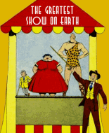
Shiver my topgallants! I enjoyed the heck out of this book. The art is good, the stories are compact and well-plotted--with one exception, to be noted momentarily--and an attempt is made to capture the spirit of the times. Or rather, the spirit of movies about the times. There is more Hollywood than history here.
I liked the "Captain Daring" story exclusively because of Reed Crandall's beautiful artwork. Crandall was a master of period stories, and pirates seemed to have a special appeal to him. Historians dwell on Crandall's gritty horror and combat stories but seldom mention RC's knack for drawing sexy women. He pulls out all the stops for dear Tezca. I kept hoping the other shoulder of that shirt would fall, but doggone it...
The trouble is, the story is STUPID! The pirate on page 8 states the story's theme: "She's like any other silly woman, after all!" I mean, this tough pirate babe has known Captain Daring for maybe two minutes, and not only offers him a role as her co-star but sighs and moans and swears she loves him. Okay, she killed him first before deciding she loved him, but really. Two minutes! And at the end she commits suicide not so much because she faces prison, but because she couldn't score with Captain D. I know things have to move quickly in short stories, but Tezca's instant passion is a load of rubbish.
The "Spanish Main" story is the best in the book. It's a solid tale with good character and emotional interest. Maybe it's not the most original plot, but it's well-written, fitting neatly into six pages without feeling hurried. The art isn't as good as Crandall's, though obviously inspired by him. The artist makes an honest effort at local color and his characterizations are good.
"Eric Falcon" is okay, though I knew the secret of the "blank" page immediately. Probably because I read about lemon juice ink in Codes and Secret Writing when I was in junior high. The artist puts a good deal of work into this story, but the final product doesn't look as good as it could because of some awkward compositions. For some reason I get a Bill Ward vibe from this. It's the only story in the book in which the Quality house ink job is intrusive. The heavy inks actually look all right on the other three features.
I've read a couple of "Black Roger" stories before, and this one isn't as heavy on Muslim/Moslem-baiting as the others. The artist gives us a nice feel for the Firedrake's size. In fact, the entire art job is pretty good. Black Roger's mask looks like The Spirit's. One schtick in the other Black Roger stories that is missing here is Barty being alarmed by Roger's falling for some lovely lass--sometimes to the point of breaking up the romance. Quality's "Arizona Raines" westerns used the same device...Arizona's boy sidekick fears his pal will be trapped into "settling down." Plenty of room here for theories about the duos' relationships.
The text story was okay, though rather brisk.
As for the ads: Jerry Fasano's plea for better schools has a somewhat bitter taste in light of the current effort to dismantle America's public schools and turn them into profit-making entities dispensing substandard mush to those whose parents can't afford elite institutions. I've seen this PSA dozens of times and it always jars me how the kid's nose lines up with the corner of the room in panel one and the awkward way his chin gets mixed up with the lamp in panel two. Tangencies, we artists call 'em.
Not a lot of advertising--only four pages, three of them on the covers. Has anyone seen an Automatic Chord Selector? Maybe if I had one I could get a few dates, too.
Not one but two he-man ads, one after the other. Charles Atlas must have paid more; he got the back cover. There's a match to remember: George Jowett vs. Charles Atlas, fight to the finish. Atlas would win because he has the better name. "George Jowett"? And look, George cribbed Charles' bully-on-the-beach episode. Without the kicked sand.
Five years ago I was a four-stone apology. Today I am two separate gorillas.
 Author
Topic: Week 46 - Buccaneers #23 (Read 3546 times)
