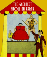
When you see a comic is published by Parents Magazine Press you know it's going to be safe and wholesome. But this isn't a bad thing. These stories are varied and adventurous and don't preach. The Jack Armstrong tales move at a good clip, though the surprise villains aren't very surprising.
"The Arctic Mystery" is a satisfyingly rousing story. The problem is the art (see below).
"This is What Happened:" Yawn. Reminds me of Heroic Comics. I never warmed to these 3-page true-life adventures. None of the sports fillers excite me either.
"Vic Hardy:" Surprisingly interesting. The scientific detection tricks are new to me. I'm not sure what's happening in the last panel of page 17. Vic's recovering the ashes of the bonds but there seems to be a rag or a crumpled piece of paper in the stovepipe. Funny to see the hero of the story drawn like a standard comic book villain.
"Man of a Million Faces:" Another action-packed story with a telegraphed ending. When the story's titled "Jack vs. the Man of a Million Faces," once you figure out Sam is the culprit (in panel 2 of the second page) you know he's the MOAMF. I like that the shifty half-breed turns out to be a good guy. However the subplot about liquored-up "bad Indians" is incongruous. The story would have worked fine if they were ordinary henchmen. Panel 4 of the last page baffles me. We just saw MOAMF's ugly puss in panel 3; why this huge wordless portrait? I swear it looks like the panel is a last-minute pasteover covering something the editor didn't like.
The art in the Jack Armstrong stories is capable and easy to look at. The notes say it's Howard Larsen. I'll accept that. I'm no Larsen expert; the only thing I know him from are his T&A westerns. Neither T nor A are present here. The problem isn't with Larsen's drawing, it's his layouts. As Mazz noted, Larsen uses some unique angles in the first story. But some of his choices are crazy. It reminds me of the old days when you were carrying the camcorder at your side and didn't realize it was running. Larsen's camera always seems to point at the wrong thing. Examples: Arm covering the speaker's face (Pg. 5 Pn. 3). The speaker and the gas cans, the subject of the panel, barely discernible (5:5) Jack, though mentioned in the caption, is barely visible and his husky is nowhere to be found (7:4). My favorite is 6:6, where we have a nicely-drawn upshot of a boardwalk with a teensy glimpse of the speaker and a great view of a dog's butt.
Equally maddening is the way Larsen refuses to draw Jack! After the shot in panel 2 of the first story page we don't see Jack clearly for two pages. In much of the story his back is to the camera, or he stands a mile away, or appears in silhouette, or lies halfway out of the panel. Larsen is not as eccentric in the second story, but he continues to push important figures far into the background. Very, very odd.
"Change of Pace:" Didn't read it. Nice drawing by Edd Ashe.
"Simba Bwana:" A decent story with refreshingly un-stereotyped "natives." True, the people speak that overly-formal English that comic book natives speak when they're not speaking Tontoese, but it isn't oppressive. A Jack Sparling art job; nice lions.
"Angel of Mercy:" Another pretty good story. It smacks a bit of True Comics but it holds interest. The problem is that Betty Fairfield, the alleged heroine, barely has anything to do. The plucky "District Nurse" is the star of the show. Though Jack Sparling cops out with silhouettes early on, he delivers a sound art job. His nurse is rather pretty. As I grow older my appreciation for Sparling's art grows. As a kid I detested him.
The survey is so intrusive you'd think it's an Internet form. I note that Jack's radio show played on KJR, which during my youth was the big Rock 'N' Roll station in Seattle.
"Billy Rings the Bell:" The gimmick is given away in the opening caption with the word "mussel," but I can't see any way out of it. The newspaper ad has to spell the word properly, so we know Billy will make a fool of himself. The ending makes up for it. Billy derives some benefit from his new muscles in an amusing way.
Bottom line: not a bad little comic.
 Author
Topic: Week 60 - Jack Armstrong #1 (Read 3410 times)
