in house dollar bill thumbnail
 Total: 42,817 books
 New: 194 books


small login logo

Please enter your details to login and enjoy all the fun of the fair!

Not a member? Join us here. Everything is FREE and ALWAYS will be.

Forgotten your login details? No problem, you can get your password back here.

Reading Group #240 2 choices

Pages: 1 [2] 3

topic icon Author Topic: Reading Group #240 2 choices  (Read 3443 times)

SuperScrounge

  • VIP
message icon
Re: Reading Group #240 2 choices
« Reply #25 on: March 11, 2021, 04:03:10 AM »


You seem to have a reasonable knowledge of The Canadian Whites for an American, given that they were, and are, so rare in relation to the US print runs and sales, and how much the prices of those rare books have been bid up to astronomical levels by nostalgic Canadians.  Or are you a Canadian?


I'm an American.

Years ago on the GCD Main group someone posted a link to the Library and Archives Canada scans of the Bell Features collection and suggested using them to fill in the missing data on the GCD, so I started reading and indexing.

Besides loving comics I love learning about the history of comics so I would also look up information about the history of the Canadian Whites and the people who made them.
ip icon Logged

SuperScrounge

  • VIP
message icon
Re: Reading Group #240 2 choices
« Reply #26 on: March 11, 2021, 04:38:13 AM »

New Fun Comics #1

Except for the Oswald strips, which stand on their own, most of these are nearly one-page starts to longer stories, so it's kind of hard to really judge them.

That's one of the annoying things about these earlier comic books, they don't really give you enough stuff to sink your teeth into. Even comics reprinting newspaper strips had this problem at the beginning, so when they started collecting multiple strips of a feature, or longer original stories, they became better as one got a larger chunk of story to be invested in.

I was amused by the feature 2023: Super-Police. Hey! That's just 2 years away!  ;)
ip icon Logged

The Australian Panther

  • VIP
message icon
Re: Reading Group #240 2 choices
« Reply #27 on: March 11, 2021, 07:33:56 AM »

I have no problem with anyone reviewing issue #2 of No Fun. I did not realize that New Fun #1 on the site was incomplete.
My motive for choosing it was because of its  presumed historical importance. If it is the first comic specifically created as a comic book and not a collection of previously published strips, how does it stand up?
What influences on the contents can we discern? What influences on later comics can we discern?   
Looked at that way, there could still be a lot to say about it even if it is not complete.
If someone knows of an earlier or more worthier candidate, please share that with us.
Both books I chose are interesting, I feel, because of their publishing history as well as their contents.

Cheers!   .   
 
ip icon Logged

Adamanto

message icon
Re: Reading Group #240 2 choices
« Reply #28 on: March 11, 2021, 01:44:23 PM »

By the way, I see the New Fun 2 upload on the site is actually missing a page (page 22, with Buckskin Jim and the Captain Spinacker topper - the issue here replaces it with a duplicate of page 20 with Cap'n Erik) - I have an older fiche scan of this issue that has the page in question, should I upload a version of the issue that includes the fiche scan of that page in its proper location? And how can I do so?
ip icon Logged

Robb_K

  • VIP
message icon
Re: Reading Group #240 2 choices
« Reply #29 on: March 12, 2021, 03:07:44 AM »


By the way, I see the New Fun 2 upload on the site is actually missing a page (page 22, with Buckskin Jim and the Captain Spinacker topper - the issue here replaces it with a duplicate of page 20 with Cap'n Erik) - I have an older fiche scan of this issue that has the page in question, should I upload a version of the issue that includes the fiche scan of that page in its proper location? And how can I do so?


I'd guess that, ideally, the existing folder would be augmented by adding the single fiche scan for the missing page and the duplicate scan would be removed.  But, a simple solution for reviewing the book would be for you to simply upload the scan of the missing page as a post on this thread. 
ip icon Logged

SuperScrounge

  • VIP
message icon
Re: Reading Group #240 2 choices
« Reply #30 on: March 12, 2021, 03:36:49 AM »


If it is the first comic specifically created as a comic book and not a collection of previously published strips


Well, the first that had a second issue certainly.  ;)

I believe the first all original newsstand comic period is credited to Detective Dan, Secret Operative No. 48 which appeared in 1933 and which was a reading group selection in Week 19.

There was no second issue and the character went on to become the newspaper comic strip Dan Dunn.
ip icon Logged

crashryan

  • VIP & JVJ Project Member
message icon
Re: Reading Group #240 2 choices
« Reply #31 on: March 12, 2021, 07:29:07 AM »

Checking out New Fun #2 seemed the closest thing to reviewing #1, but I'll be honest. It's income tax season in the USA and I've spent two days immersed in assembling the year's receipts, etc. Right now I haven't the patience to go through a book of single-pagers one at a time.

Suffice it to say that in New Fun we see a publisher sticking his toe into the water before diving in. Everything is formatted like newspaper strip reprints. It doesn't seem to say anywhere that all the material is original. Maybe they thought kids preferred strip reprints and this layout would fool them into buying the comic. It's not a great format. There are a variety of features, which is good. But each character gets only a page or two of a continued story. Maybe it would have worked if the comic were a weekly, like British comic papers. That's what the editorial says they're aiming for. Alas, New Fun readers must wait a month to see what amounts to the next week of dailies. It's interesting to see some genuine newspaper artists in the bunch. Charles Flanders would take over Secret Agent X-9 the following year. Lyman Anderson was already working on Inspector Wade. Lawrence Lariar was already an experienced cartoonist. He later wrote novels, sold cartoons, and edited the long-running Best Cartoons of the Year series. My favorite artist here is the almost-forgotten J. Clemens Gretter. He has a knack for rivet-and-boiler plate science fiction.

Super Duper Comics #3 is a nice mix of features. The art is somewhat better than the writing.

Mister Monster is classic Golden Age hero stuff. Short on logic, long on mayhem. Even in the Golden Age, sticking a pistol in the monster's mouth and blowing its brains out is unusually graphic. Kelly's art is good overall if light on the backgrounds. His caption placement is annoying. Often a caption that's supposed to be read before reading the dialogue is under the panel, Italian Golden Age style. I could live with that if Kelly were consistent, but sometimes the first-read caption is over the panel.

I like Kelly's art in Cinder Smith better than that in Mr Monster. The story is crazy! Mike Riley the brakeman knows Ape Hogan extorts money from hoboes and beats them up, but he shrugs it off as "a racket he's got!" In fact everyone knows about Ape, but instead of getting him fired all of them, including the hero, lets it slide because "after all, Hogan was a big man..." Months later the disfigured hobo returns vowing vengeance. Cinder has the man promise to meet him in the caboose and leaves him unwatched. Half an hour later it occurs to Cinder that the hobo has stood him up. Deep thinking isn't in Cinder's makeup, I guess. I don't know why the hobo figures Mike Riley must die for discovering he murdered Ape. He should have just cut and run. Judging by their earlier actions neither Cinder nor Riley would have done anything about it. Final gripe: the layout on our page 17 is a mess. It's unreadable even with the arrows, because Kelly leaves out the arrow between panels 4 and 5 and we tend to jump right from 4 to 6. Adding insult to injury is the barely-visible "later:" squeezed between panels 5 and 6.

Rene Kulbach's art in Out of the Woods is pleasant, though the lead character is drawn as if he's dimwitted. Maybe he's supposed to be dimwitted. Fuzzy (who remains anonymous until page 4) seems spaced out half the time. Is he a reluctant hero ("I've heard that cry once before, and I had to shoot the weasel--I don't know why I do it.")? His heroic deeds are mostly accidents. One more thing: are we supposed to believe that the bunnies don't know a fox when they see one??

Tang demonstrates that Rene Kulbach can draw realistic-style stories as well as he can funny animals. The story is routine but it reads better than the previous two features. The lettering is exasperating. Captions are in ROMAN TYPE WITH CHARACTERS' NAMES IN ITALICS while balloons are lettered in ITALIC TYPE WITH NAMES IN ROMAN. Plus Tang's name is always put in quotes.

Everything's been said about Java Bean, the character, so I won't rehash it. The story offers some funny gags but it rambles. Either of the two sub-stories (foiling the landlord and selling magic potions) would have worked better as individual episodes. Does Java Bean really mean his mother "don't bother payin' de rent?" That gives Trader Korn a legitimate reason to "eject" them. (Is "ejection notice" Canadian for "eviction notice"?) JB's family would be more sympathetic if they're too poor to pay the rent.

In Jeff Waring we see an artist who wants to draw people, just people, and nothing but people. Granted Murray Karn draws good people. Still, he could have put a little effort into drawing that embarrassing steering wheel in panel 4 of the first story page. Better yet, he could have drawn the seat against which Kay is(n't) leaning in panel 3. And he could have drawn any part at all of the action in the final panels of the last story page. Karn's figures remind me of Stan Pitt, less elaborately inked but sharing Pitt's sleek Alex Raymond look. The story isn't much but I appreciate Kay's gutsiness. No shrinking Dale Arden, she.

This is my introduction to Nelvana of the Northern Lights, though I've certainly heard plenty about her. This story reads like an introduction to new readers of a long story arc from another comic. I got enough information to understand the character though I'm unsure of her super powers or of the relationship between Glacia, the underground land, and the surface where the Eskimos live. While Dingle's art is good, the action in the last two pages is hard to follow.

A respectable comic, all told, and much better than the same company's Dizzy Don.
ip icon Logged

Robb_K

  • VIP
message icon
Re: Reading Group #240 2 choices
« Reply #32 on: March 12, 2021, 09:28:19 AM »


Everything's been said about Java Bean, the character, so I won't rehash it. The story offers some funny gags but it rambles. Either of the two sub-stories (foiling the landlord and selling magic potions) would have worked better as individual episodes. Does Java Bean really mean his mother "don't bother payin' de rent?" That gives Trader Korn a legitimate reason to "eject" them. (Is "ejection notice" Canadian for "eviction notice"?) JB's family would be more sympathetic if they're too poor to pay the rent.


No!  There was no such thing as an "ejection notice" in Canada during the 1940s through the 1960s.  I'm sure that Hoyer was using the "Negro" stereotype of not using proper English and mixing up words as a joke. I think it is interesting that Canadians of African slave extraction, on average, improved the quality of their speech much, much more than their US counterparts, due to having much more integration within theoverall communities of cities than in The US South, with its strict legislated segregation, and The US North, with its giant big city ghettos and de-facto segregation.  There were small or tiny ghettos in Halifax, Ottawa, Montreal, and Hamilton.  But most of the Black Canadians could NOT be immersed daily only among their own people to preserve their dialect.  They were interspersed among the general population, and so took on their respective regional Canadian dialects.  I assume that Blacks who migrated to Quebec learned Francais Quebecois as did my Dutch cousins who immigrated to Montreal.

I think it is very interesting that Walter Lantz's Li'l Eight Ball started out in 1942 with the same extremely  exaggerated, stereotyped Southern US African-American dialect, and in 1946, his speech was changed from one issue to the next, to normal American national colloquial (comic book) speech, apparently because of letters to the editorship that it was way too over-the-top and too demeaning.  But,I'm impressed that they didn't first try to just tone it down, rather than getting rid of it altogether.

I think what was true about the "Amos and Andy" TV Show and Disney's "Uncle Remus/Bre'r Rabbit" newspaper strip, that most Black people at the time they were running, liked them, and were NOT offended enough by the outwardly intended or unintended racism, or insensitivity that allowed it, to let those facts get in the way of them seeing their people's artistic performances, and enjoy them, and not want those opportunities for their people to participate in their nation's culture taken away, was also true about at least seeing their people represented in comic books, even if they were somewhat stereotypically racist.  Java Bean WAS the protagonist and hero (winner) of his strip, even though he was also the butt of some stereotypical jokes and gags.  The same was true for Li'l Moe.

« Last Edit: March 12, 2021, 09:31:02 AM by Robb_K »
ip icon Logged

Adamanto

message icon
Re: Reading Group #240 2 choices
« Reply #33 on: March 12, 2021, 10:44:17 AM »


By the way, I see the New Fun 2 upload on the site is actually missing a page (page 22, with Buckskin Jim and the Captain Spinacker topper - the issue here replaces it with a duplicate of page 20 with Cap'n Erik) - I have an older fiche scan of this issue that has the page in question, should I upload a version of the issue that includes the fiche scan of that page in its proper location? And how can I do so?


I'd guess that, ideally, the existing folder would be augmented by adding the single fiche scan for the missing page and the duplicate scan would be removed.  But, a simple solution for reviewing the book would be for you to simply upload the scan of the missing page as a post on this thread.


I'll just do that for now then:

ip icon Logged

Adamanto

message icon
Re: Reading Group #240 2 choices
« Reply #34 on: March 12, 2021, 12:19:08 PM »


Suffice it to say that in New Fun we see a publisher sticking his toe into the water before diving in. Everything is formatted like newspaper strip reprints. It doesn't seem to say anywhere that all the material is original. Maybe they thought kids preferred strip reprints and this layout would fool them into buying the comic.


On the contrary, the selling point of New Fun was that it was all comics you HADN'T read before in the paper. You're right it seems a BIT understated, but the "new" in the title is supposed to indicate this, and it says "NEW comic strips" at the bottom of the cover. Starting with issue 3 they'd put "All original" in the corner box to apparently make it a bit more clear.

As for what kids preferred, well, this was the first time they were given a choice. Every other comic book on the newsstand was (mostly) reprints of newspaper strips, the idea here was to push the fact that THIS book was different and contained comics created specifically for it and see if readers wouldn't prefer that over stuff they had already read.

New Fun was allegedly inspired by the American version of Comic Cuts, a very short lived (9 weekly issues) tabloid sized comic book based on the British comic book of the same name. Comic Cuts was all newspaper strip reprints as well, but unlike the other American comic books at the time, it had reprints of BRITISH newspaper strips that would be entirely new to American readers. So the idea was that if there's a market for a comic book full of comics the reader had never seen before, surely there's a market for a comic book full of comics made specifically for that comic book too.
« Last Edit: March 12, 2021, 04:04:04 PM by Adamanto »
ip icon Logged

The Australian Panther

  • VIP
message icon
Re: Reading Group #240 2 choices
« Reply #35 on: March 12, 2021, 12:58:32 PM »

Quote
New Fun was allegedly inspired by the American version of Comic Cuts, a very short lived (9 weekly issues) tabloid sized comic book based on the British comic book of the same name. Comic Cuts was all newspaper strip reprints as well, but unlike the other American comic books at the time, it had reprints of BRITISH newspaper strips that would be entirely new to American readers. So the idea was that if there's a market for a comic book full of comics the reader had never seen before, surely there's a market for a comic book full of comics made specifically for that comic book too. 

That's a memorable and significant factor in the creation of the Modern comic book. Thank you Adamanto.     
ip icon Logged

paw broon

  • Administrator
message icon
Re: Reading Group #240 2 choices
« Reply #36 on: March 12, 2021, 02:23:08 PM »

Re. early comics with original material: there were a number of British weeklies which contained origianla material, part comics part prose, but usually the comic strips were the mix of word balloons with text boxes below or above the panels.  Bear Alley posted this piece about Edwardian comics:-
https://bearalley.blogspot.com/2021/03/review-edwardian-comic-papers-by-alan.html
We have some examples of early British comics with all original material on the site.
ip icon Logged
Comic Book Plus In-House Image

Adamanto

message icon
Re: Reading Group #240 2 choices
« Reply #37 on: March 12, 2021, 03:51:54 PM »

Indeed, the idea of New Fun being a super groundbreaking innovation and "the most important comic book of all time" etc is extremely America-centric. Comic books with original material had existed for quite some time in other countries.
ip icon Logged

Captain Audio

  • VIP
message icon
Re: Reading Group #240 2 choices
« Reply #38 on: March 12, 2021, 04:29:27 PM »


No!  There was no such thing as an "ejection notice" in Canada during the 1940s through the 1960s.  I'm sure that Hoyer was using the "Negro" stereotype of not using proper English and mixing up words as a joke.


Malapropisms are an ancient staple of comedy, regardless of the color of the person using them. I don't remember the Three Stooges being Black.
ip icon Logged

Robb_K

  • VIP
message icon
Re: Reading Group #240 2 choices
« Reply #39 on: March 12, 2021, 05:17:35 PM »


No!  There was no such thing as an "ejection notice" in Canada during the 1940s through the 1960s.  I'm sure that Hoyer was using the "Negro" stereotype of not using proper English and mixing up words as a joke.


Malapropisms are an ancient staple of comedy, regardless of the color of the person using them. I don't remember the Three Stooges being Black.


If your point is that Hoyer wasn't deliberately trying to make fun of American Black-skinned people for their alleged poor use of the English in a mean-spirited, racist manner, I agree with you completely.  If he HAD felt that way, he wouldn't have made Java a hero in the story, who defeated the mean landlord by cleverness.  He was just drawing the Black characters in the 1890s - 1940s "Blackface Comedy" tradition that was carried through Vaudeville, and Burlesque, and even into the early 1950s in printed cartoons.  It had a racist beginning, but became entrenched in the general American culture, so much so, that it became commonplace and unintentionally accept by osmosis, as one picks up the language and speech habits of the people regularly surrounding him or her. 

Carl Barks didn't have a racist bone in his body.  Yet he drew liver-lipped African natives, and South Sea Islanders, because that's the general way such peoples were drawn in cartoons, comic strips and illustrated comedic books all of his life to that point.  That is also why I liked "Java Bean" as a child, before I had ever met any black-skinned person, or seen one in person, and why I still liked such stories after we moved to Chicago, and we lived among African-Americans, and why I still like them, despite understanding the roots of such humour hating any type racism, having myself been the object of such derision (because I killed the God of a large chunk of The World's population).
ip icon Logged

Captain Audio

  • VIP
message icon
Re: Reading Group #240 2 choices
« Reply #40 on: March 12, 2021, 07:05:09 PM »


No!  There was no such thing as an "ejection notice" in Canada during the 1940s through the 1960s.  I'm sure that Hoyer was using the "Negro" stereotype of not using proper English and mixing up words as a joke.


Malapropisms are an ancient staple of comedy, regardless of the color of the person using them. I don't remember the Three Stooges being Black.


If your point is that Hoyer wasn't deliberately trying to make fun of American Black-skinned people for their alleged poor use of the English in a mean-spirited, racist manner, I agree with you completely.  If he HAD felt that way, he wouldn't have made Java a hero in the story, who defeated the mean landlord by cleverness.  He was just drawing the Black characters in the 1890s - 1940s "Blackface Comedy" tradition that was carried through Vaudeville, and Burlesque, and even into the early 1950s in printed cartoons.  It had a racist beginning, but became entrenched in the general American culture, so much so, that it became commonplace and unintentionally accept by osmosis, as one picks up the language and speech habits of the people regularly surrounding him or her. 

Carl Barks didn't have a racist bone in his body.  Yet he drew liver-lipped African natives, and South Sea Islanders, because that's the general way such peoples were drawn in cartoons, comic strips and illustrated comedic books all of his life to that point.  That is also why I liked "Java Bean" as a child, before I had ever met any black-skinned person, or seen one in person, and why I still liked such stories after we moved to Chicago, and we lived among African-Americans, and why I still like them, despite understanding the roots of such humour hating any type racism, having myself been the object of such derision (because I killed the God of a large chunk of The World's population).


The use of Malapropisms in comedy goes back to the 17th century in the UK. An elderly Irish woman called Miss Malaprop was the character in a number of humorous stories that had nothing at all to do with Black people.
The features of comic book characters are almost always exaggerated no matter what race.
Black people of sub Saharan African descent usually have prognathous skull and jaw structure and what you'd call "liver lips".
ip icon Logged

The Australian Panther

  • VIP
message icon
Re: Reading Group #240 2 choices
« Reply #41 on: March 13, 2021, 12:15:00 AM »

Well, this thread is going off in some interesting directions! Which is great!   

Quote
Malapropism finds its origins in the French phrase mal a propos, which means ?inappropriate.? It is the use of an incorrect word in place of a similar-sounding word, which results in a nonsensical and humorous expression.

The word malapropism comes from ?Mrs. Malaprop,? a character in Sheridan?s comedy The Rivals, who has a habit of replacing words with incorrect and absurd utterances, producing a humorous effect. A miss-speech is considered malapropism when it sounds similar to the word it replaces, but has an entirely different meaning.

https://literarydevices.net/malapropism/
Quote
The use of Malapropisms in comedy goes back to the 17th century in the UK.

Probably goes back earlier, but without an identifying name. I think Shakespeare may have used the device in his comedies.
Have been thinking lately about the 'English' language and how it is has many different words for almost the same thing, and many similar words with entirely different meanings.[Because it absorbs words from many other different languages] I wonder if the language is one that particularly has the resources for 'Malapropisms' ?
Not much used these days, I think,because I believe the literacy standard of the general public is quite low, and the ability to decipher complex literary wordgames is somewhat lacking.
Did the Thompson Twins in TinTin use Malapropisms?
Quote
The features of comic book characters are almost always exaggerated no matter what race. 

Well, lets say often. Examples? Eskimos, American Indians, Pacific Islanders, Arabs,Asians. Often the features aren't exaggerated but facial features are and also cliche dress. At a neutral level,these are visual shortcuts.
The Character 'Java' in the cast of the Metamorpho strip, who is supposed to be Neanderthal, comes to mind. Depicted with long arms and thick forehead and jaw. Then there was Alley OoP, who was a highly popular comic strip character. Only Male Sikhs wear Turbans, [for religious reasons] not all Indians or Moslems. I believe some idiot in the US shot a Sikh soon after 9/11 acting under that misapprehension.
Not all people of Celtic descent have red hair and freckles.       
Quote
Black people of sub Saharan African descent usually have prognathous skull and jaw structure and what you'd call "liver lips".
 
Lets say, 'occasionally or sometimes' Having visited Ghana [and South London for that matter] I can categorically say those features, while they exist, are by no means universal.
Quote
Carl Barks didn't have a racist bone in his body.  Yet he drew liver-lipped African natives, and South Sea Islanders, because that's the general way such peoples were drawn in cartoons, comic strips and illustrated comedic books all of his life to that point.
   
Same can also be said of Will Eisner and the Spirit's sidekick character Ebony!
But I think I can say that neither of these creators depicted people from other races or cultures in a negative or derogatory matter. Barks often emphasized cultural misunderstanding -from both sides - but that was I felt, as a child, his method of introducing other peoples and cultures.I believe I learned more from Barks than from National Geographic.   

Cheers!


ip icon Logged

Captain Audio

  • VIP
message icon
Re: Reading Group #240 2 choices
« Reply #42 on: March 13, 2021, 03:48:44 AM »


Well, this thread is going off in some interesting directions! Which is great!   

Quote
Malapropism finds its origins in the French phrase mal a propos, which means ?inappropriate.? It is the use of an incorrect word in place of a similar-sounding word, which results in a nonsensical and humorous expression.

The word malapropism comes from ?Mrs. Malaprop,? a character in Sheridan?s comedy The Rivals, who has a habit of replacing words with incorrect and absurd utterances, producing a humorous effect. A miss-speech is considered malapropism when it sounds similar to the word it replaces, but has an entirely different meaning.

https://literarydevices.net/malapropism/
Quote
The use of Malapropisms in comedy goes back to the 17th century in the UK.

Probably goes back earlier, but without an identifying name. I think Shakespeare may have used the device in his comedies.
Have been thinking lately about the 'English' language and how it is has many different words for almost the same thing, and many similar words with entirely different meanings.[Because it absorbs words from many other different languages] I wonder if the language is one that particularly has the resources for 'Malapropisms' ?
Not much used these days, I think,because I believe the literacy standard of the general public is quite low, and the ability to decipher complex literary wordgames is somewhat lacking.
Did the Thompson Twins in TinTin use Malapropisms?
Quote
The features of comic book characters are almost always exaggerated no matter what race. 

Well, lets say often. Examples? Eskimos, American Indians, Pacific Islanders, Arabs,Asians. Often the features aren't exaggerated but facial features are and also cliche dress. At a neutral level,these are visual shortcuts.
The Character 'Java' in the cast of the Metamorpho strip, who is supposed to be Neanderthal, comes to mind. Depicted with long arms and thick forehead and jaw. Then there was Alley OoP, who was a highly popular comic strip character. Only Male Sikhs wear Turbans, [for religious reasons] not all Indians or Moslems. I believe some idiot in the US shot a Sikh soon after 9/11 acting under that misapprehension.
Not all people of Celtic descent have red hair and freckles.       
Quote
Black people of sub Saharan African descent usually have prognathous skull and jaw structure and what you'd call "liver lips".
 
Lets say, 'occasionally or sometimes' Having visited Ghana [and South London for that matter] I can categorically say those features, while they exist, are by no means universal.
Quote
Carl Barks didn't have a racist bone in his body.  Yet he drew liver-lipped African natives, and South Sea Islanders, because that's the general way such peoples were drawn in cartoons, comic strips and illustrated comedic books all of his life to that point.
   
Same can also be said of Will Eisner and the Spirit's sidekick character Ebony!
But I think I can say that neither of these creators depicted people from other races or cultures in a negative or derogatory matter. Barks often emphasized cultural misunderstanding -from both sides - but that was I felt, as a child, his method of introducing other peoples and cultures.I believe I learned more from Barks than from National Geographic.   

Cheers!


Well I'll let you argue with the Smithsonian  about facial features of Sub Saharan Africans.


The Somalians spent generations trying to drive the Nigerians to extinction through genocidal warfare and carrying off survivors to sell to Arab slave traders. Otherwise the facial features would be even more common than they still are among Black populations in North America.
It may surprise you to learn that the genetic coding for these features are recessive. If one parent is of a race with finer features the offspring general will be as well.
There are at least three mixed race children in my extended family so I've seen that first hand.

The thicker lips of sub Saharan black people is in fact considered an example of an advanced evolutionary adaptation. I'd have to look it up to give you the skinny on that but apparently along with the wider nose they are more comfortable breathing in extreme climate conditions. less loss of moisture in the breath among other things.

In Ghana you probably never saw a pure blooded member of any of the populations that lived there before the Arab, French and Portuguese  moved in and disrupted their natural development.

BTW
The term Caucasoid has nothing to do with skin color, at least in Anthropology, its a classification of skull shape.

Also.
" Often the features aren't exaggerated but facial features are and also cliche dress."
Remember all those African Witch Doctors in comics and films who wore a small skull on a necklace?
Turns out they actually did.
An African doctor was going through his family's heirlooms a few years back when he found his great great grandfathers Witch Doctor Paraphernalia . The small skull was among these.
He found this was a very detailed stone carving , the exterior covered with lines of an ancient script. He found someone who could translate this secret language and discovered these were instructions on how to treat head injuries.
The sound made when the damaged area was pressed was used to determine the best course of treatment. These little skulls were apparently the work of an ancient but in many ways advanced civilization still unidentified.
Artists used the photos and drawings found in publications on Anthropology and travel to get the gist of how people dressed in far off lands. Some artists were less studious than other.

The Native American cultures fascinated some of the most talented artists and pioneering photographers of the 19th century. Some lived with the Indians for many years as they created the works that still grace our museums.
In Western Comics the dress of the cowboys is more likely to be grossly inaccurate than that of the Indians.
It always irks a gun collector to see the Buscadero gunbelt used in a film depicting events of pre 1900's.
In recent years such anachronisms are less often seen, if the production is of reasonable quality.
In historical fiction a Roman cavalryman using a saddle with stirrups is another anachronism. The Stirrup was a medieval development.
If such lack of detail detracts all that much from enjoying a story then find another genre. Or just get used to it.
If you look for something that you can interpret as racism you will certainly find it whether it is actually there or not.
ip icon Logged

The Australian Panther

  • VIP
message icon
Re: Reading Group #240 2 choices
« Reply #43 on: March 13, 2021, 06:11:06 AM »

Quote
Black people of sub Saharan African descent usually have prognathous skull and jaw structure and what you'd call "liver lips".

It's the 'usually' that I have a problem with.
Quote
In Ghana you probably never saw a pure blooded member of any of the populations that lived there before the Arab, French and Portuguese  moved in and disrupted their natural development.

Exactly, that's why it's the 'usually' I have a problem with.
If your point was , Pureblooded Black people of sub Saharan African descent biologically often have  prognathous skull and jaw structure and what you'd call "liver lips".  Again, fair enough.
Quote
In Western Comics the dress of the cowboys is more likely to be grossly inaccurate than that of the Indians.
Well no real argument there, both depictions are more often inaccurate than accurate. Just look at the dress of the cowboys in particular in some of the early golden age westerns on CB+  You can make the argument that how cowboys and Westerners are depicted is influenced as much by the year in which the comic or movie was produced as the period that the story is set in. 
Quote
In recent years such anachronisms are less often seen, if the production is of reasonable quality. 

Trouble is not all modern productions are of reasonable quality. I believe that, since movies and comics and TV are made to appeal to a modern audience then some anachronisms are becoming the norm. Dialogue in particular, is not accurate since it is usually modernized so what is said can be understood by a modern audience. 
Go back and read books and stories written 100 years ago and you will see the difference in what is depicted. My recent post quoting Clarence E Mulford is an example.
Quote
If such lack of detail detracts all that much from enjoying a story then find another genre. Or just get used to it.
  I found, very early on, that a lot of reading is done to escape from daily life into a fictional world. I also found that the fictional world must be believable in its own right and that the work is more valid and believable if the creators are actually dealing with real issues. In other words, you can never really escape from reality by reading fiction. But at the same time you can enjoy for example E
R Burroughs work, Jules Verne, 1930's Western Movies, hell, Archie comics or the X-men on one level while being perfectly aware of their faults or foibles and distance from reality.                 
ip icon Logged

The Australian Panther

  • VIP
message icon
Re: Reading Group #240 2 choices
« Reply #44 on: March 13, 2021, 06:35:57 AM »

Quote
Biologically, Race is Really Only Skin Deep

https://www.healthline.com/health-news/biologically-race-only-skin-deep#Still,-racism-exists

Decades of research has shown the lack or genetic difference between racial and ethnic groups. The idea of ?race? doesn?t hold up to scientific scrutinty.
?Broadly thinking about what part of the world people?s ancestors might have come from is fine, but to take it to the next step and say that somehow different races are different types of humans is incorrect,? William R. Leonard, PhD, biological anthropologist and professor of anthropology at Northwestern University, told Healthline.
?In reality then, all the variation of traits we see, in some respect, is literally skin deep. What appears to be huge amounts of variation is masking a low level of genetic diversity,? said Leonard.

The fact that there is so little genetic diversity among humans has been known for a while, but not widely understood, noted Leonard. In fact, in 1950, the United Nations Educational, Scientific and Cultural Organization (UNESCO) issued a statement that all humans belong to the same species, and that ?race? is not a biological reality, but a myth.

?Races are an artefact of the human mind?s need to put things into boxes. That?s the way we break up and describe the world,? Leonard said. ?This is the paradox of the human experience. Relative to other species, we are genetically all very similar. However, in contrast, in terms of our phenotype, meaning how we look externally ? height, weight, hair color, eye color ? we are a very diverse species.?


Quote
Rather than race, anthropologists say a more accurate way to distinguish differences in populations of people are clines. A cline is a gradation in one or more characteristics within a species, especially between different populations. The concept of clines helps to explain that races as biological categories are not valid.


Quote
?The history of our species is mixing. Even though we often think marriage and lineages are maintained in groupings of populations, that?s not the case at all throughout the history of our country, and it?s certainly not for our species at large,? said Leonard.

He pointed to conclusive evidence that Neanderthal DNA exists in many of the human species.
[And also now Denisovan DNA - and I'm sue that there will be more to come.
https://www.ancient.eu/Denisovan/]

?Even in our evolutionary past, our earliest modern human ancestors in Europe and parts of Asia were exchanging genes with related human populations that existed at the same time. Mixing of genes and gene flow and spread of genes and population expansion is something that is literally as old as human history itself,? Leonard stated. 


ip icon Logged

Captain Audio

  • VIP
message icon
Re: Reading Group #240 2 choices
« Reply #45 on: March 13, 2021, 06:28:51 PM »


Quote
Biologically, Race is Really Only Skin Deep

https://www.healthline.com/health-news/biologically-race-only-skin-deep#Still,-racism-exists

Decades of research has shown the lack or genetic difference between racial and ethnic groups. The idea of ?race? doesn?t hold up to scientific scrutinty.

This is PC bull pookey. Ask anyone who has a family member who has Sickle Cell Anemia.
The DNA of the Chimpanzee is also very close to that of humans, despite humans having one less pair of chromosomes.. The tiny fractions are what makes a difference. A High School and a warehouse may be constructed of identical bricks from the same factory on the same day but with few exceptions high schools are not warehouses.
Quote

?Broadly thinking about what part of the world people?s ancestors might have come from is fine, but to take it to the next step and say that somehow different races are different types of humans is incorrect,? William R. Leonard, PhD, biological anthropologist and professor of anthropology at Northwestern University, told Healthline.
?In reality then, all the variation of traits we see, in some respect, is literally skin deep. What appears to be huge amounts of variation is masking a low level of genetic diversity,? said Leonard.

Leonards argument is specious in the context of appearance in artwork.

Quote

He pointed to conclusive evidence that Neanderthal DNA exists in many of the human species.
[And also now Denisovan DNA - and I'm sue that there will be more to come.
https://www.ancient.eu/Denisovan/]   

Yet there is to all intents and purposes none in the DNA of the true Sub Saharan genotype.
Quote

?Even in our evolutionary past, our earliest modern human ancestors in Europe and parts of Asia were exchanging genes with related human populations that existed at the same time. Mixing of genes and gene flow and spread of genes and population expansion is something that is literally as old as human history itself,? Leonard stated. 

I mentioned Sickle Cell earlier. The only non African population with a significant incidence of Sickle Cell are the Mediteranean islands. They received it by limited inter breeding with African mercenaries who fought in most of the wars of the classical period and later.
The Sickle cell mutation thrived in that region because it offers practical immunity to many insect borne diseases which were common to the region.
At the same time African Americans descended from slaves imported into what is now New York state by a Norwegian slave trader (who liked to sample his wares) bear a mutated gene found only in Norwegian populations. A beneficial mutation that gives a certain resistance to retro viruses like HIV.

The original use of the term "race" had zero to do with skin color. Your race was your culture and area where your culture thrived.
Even in the 18th century citizens of the United States were occasionally referred to as "the American Race" by Europeans.
The use of the term in tracing the genetic heritage of modern peoples is obvious enough.

All of which is of little importance to the supposed stereotypical illustrations in comic books.
If you want to illustrate New Guinea Head Hunters you draw them with very dark skin, round heads, protruding dentation and relatively large lips.
If you want to illustrate a Somali tribesman you give them very dark skin but somewhat finer features.
If you want to illustrate an Ethiopian You give him Caucasian features and much lighter skin.

An Irishman of strong Celtic roots would have a much rounder skull (Brachycephalic vs Caucasoid) than most white European populations, its in their genetic code.

With a mixed race character just use your imagination.
ip icon Logged

gregjh

message icon
Re: Reading Group #240 2 choices
« Reply #46 on: March 14, 2021, 11:03:38 AM »

I was a bit hard on New Fun at first, before I realised its place in history. Obviously the backgrounds are very sparse and the stories are wafer thin but that's because it was a prototype of a new era i comics.

Having failed to find the full version of some of the comics that Robb shared the cover of, I reverted to Super Duper Comics. I can politely say it's not for me. I really couldn't even see what the story was in Mister Monster. Ancient monster gets released by a German bomb, runs out, grabs a female victim, scientist runs after him and shoots him through the skull. The end.

Cinder Smith was an interesting idea: a young man monitoring a remote rail station by himself, but once again the storytelling seemed bizarre and illogical. A thug extorts squatters in the carriages, then Cinder goes off on a bizarre hunt for hima nd then fights somebody else on a cliff edge. The final panel is Cinder explaining, mundanely, why he didn't make the search alone.

ip icon Logged

Robb_K

  • VIP
message icon
Re: Reading Group #240 2 choices
« Reply #47 on: March 15, 2021, 06:26:12 AM »

Now I will review "New Fun Comics No. 1 and 2:

New Fun 1
I just have to make a few comments about these single comics pages.  First of all, one page of a story is worthless to me.  I HATED reading the daily newspaper and for continuing stories, having to wait till the next day to see what happens next.  Never mind having to wait a whole week for the Sunday strips' next episode.  Imagin having to wait a whole month for the next single page of a "New Fun" continued story!  For a similar reason, I don't like that The Oswald Rabbit one-tier gags were separated from each other.  I'd rather have looked at them all on one or two pages.

Jack Woods had good action, and caught my interest.  So did Wing Brady, Ivanhoe, and Bubby and Beevil.  And Tom Mix looks like it might be all right.  The artwork on all those is very good.  But, Tom Mix's episode didn't have any action and yet, seems to be a stand-alone mini-story.  Ivanhoe's artwork is terrific.  I've always liked Pelion & Ossa, so I'm sorry we don't get to see Issue #1's page.

New Fun 2
This issue had some nice surprises.  I enjoyed the Sports Page - especially the article on Japanese Baseball, and the sports quiz. 

Sandra of The Secret Service was quite good for one page, having good action, great artwork, and a good cliffhanger about a dictator of an exotic country, who is a scientist who has invented a death ray he plans to use to conquer The World. 

The Magic Crystal of History stars a boy & girl who use it to go back in time.  This shows us how much more we know about history now than we did 100 years ago (I keep forgetting that I've been around for 3/4 of that time). This episode showed The Egyptians of 4,000 BC using slaves to build The Pyramids (off by 1,500 years and weren't slaves). 

Wing Brady - another interesting action-packed episode, with yet another great cliff-hanger.  Wing, suspended from his airplane by a rope, has hold of a captured Bedouin chieftain, but the rope is fraying, and we know it will break next episode, and the 2 men will drop to the ground, we know not where.

Ivanhoe - is drawn excellently, but has had no action nor dialogue in 2 episodes,  So, I guess it is just a classic historical novel told through illustrations and narrative, like a history book.  I'm disappointed in the format.  And THAT, combined with having to wait a month to see just one more page, would have killed it for me.

Don Drake - On The Planet Zaro - This is New Fun's own Buck Rogers clone.  The artwork is pretty decent.  But, being a scientist, I never really liked these fantasies that had elements in them that went way against my judgements on what is possible and not possible given what I knew about physics, chemistry, and biology, even at a young age.  On the other hand, I never would have believed airplanes could fly, television could have images sent through cable wires and radio waves could send sound over long distances to a receiver, and ridiculous amounts of data could be operated on by microscopic circuits, etc., had I been asked if I believed those things could happen before they did. It has alien crablike monsters and a great cliffhanger. And Drake has the requisite atomic powered ray gun. These 1-page episodes are a drag. They make one appreciated special reprints of collected strip episodes. (I HATE when MY OWN epic, 20+ "Uncle Scrooge" or "Donald Duck" stories are serialised in 3 consecutive weekly issues.  Imagine how I'd feel if 30+ page stories were chopped into 30+ pieces!

Loco Luke- A cartoony comedic cowboy in the Old West with Indian friends, fighting lawbreakers. Could a faint memory of THIS have somehow been the inspiration for Morris' "Lucky Luke" in the late 1940s?  He's a similar type of character, and his horse is extremely intelligent, talented, and funny, just like Jolly Jumper (The Smartest Horse In The World).  All those similarities, along with the so very similar name, make me feel like it's all wayyyy too much to be a random coincidence.  Even Jack Warren's artwork is somewhat reminiscent of the Post WWII Franco-Belgian style.  Could even Franquin have been inspired by Warren's work???

Oswald The Rabbit - Changing the dividing of Oswald's tiers among 4 different pages to placing them all on 1 page was a good move.  And the strip seems to be a continuing story now.  If I remember correctly, it was a mixture of 1-page gags and fairly short, continuing scenarios and a few short stories.  The artwork is standard for cartoon strips of the time.

Pelion & Ossa - The gag is pretty routine, but the artwork is nice.

2023 Super Police We're only 2 years away from that Science Fiction year. I had the same feeling in 1984. Actually, as a child I had a feeling I wouldn't even make it to the year 2,000. The science in this strip is interesting.  A wall of light made of gamma rays keeps water coming inside an open outer area of a space and undersea vehicle under the ocean.  It seems that The US government is at war with pirates.

Tom Mix This was also a stand-alone, 1-page completed, short scenario.  I assume that all of his strip episodes probably were (like distilled episodes of his radio programme episodes (which can only contain a few highlights). Not a very good format for Western action/moral stories.  I'd rather they be no less than 8 pages per story, and ideally 10 or 12.

There are some interesting strips, but having them issued as one page each, and only once per month is an interest-killer.  I'm sure I wouldn't have asked my parents to buy me that book, and wouldn't have paid 10 cents for it new, or even 5 cents for it from the 2nd hand rack, if it had been out in that format in the late 1940s or early '50s.

« Last Edit: March 15, 2021, 07:13:56 AM by Robb_K »
ip icon Logged

The Australian Panther

  • VIP
message icon
Re: Reading Group #240 2 choices
« Reply #48 on: March 22, 2021, 08:37:23 AM »

Well, this one has been interesting! I Chose a book which wasn't all there and then the thread went off on unexpected tangents. An interesting thread, but surprising and maybe disappointing. I am amazed at how much I learn from doing the Reading Group, and I don't mean just about the content of the chosen books, but also about communicating and listening to people and many other things.
Superdooper comics #3.
https://comicbookplus.com/?dlid=4438

With Mr Monster in Red, dead centre in a bright yellow cover, this comic would definitely catch your eye on the stand.

The Mr Monster story is pretty straightforward and generally well-drawn, Although very uneven.

The best page is the splash with the classic Mr Monster Font and the iconic Mr Monster image.
Interestingly, Michael Gilbert never changed either and that's unusual for a Golden Age character revival.
Cinder Smith.
I was less interested in the story than I was in the art, again I liked the Splash font and Fred Kelly has good visual instincts, he uses creative page layouts, but he was clearly working on his own, possibly to a deadline. The work looks at times more like fan art than professional work.   
Fuzzy the bear saves Powder-Puff :- Excellent art, some interesting ideas, but overall, a disappointing and unsurprising story.
Tang:- Again, nice art, but unsurprising and unsatisfying story.
Java Beans:- This is just plain crazy, on this copy I can't read all of the balloons. I have to wonder if Hy Moyer was involved with animation, as this strip has the elements common to many animated cartoons in the 30's and 40's.
Hy Moyer here.
Punch in Canada [Hy Moyer]
https://punchincanada.blogspot.com/2008/05/harry-b-moyer.html
Jeff Waring:- Excellent art again. Story is a bit disjointed tho.
Nelvana of the Northern Lights:-
I quite like this, not sure if I can articulate why. An awful lot happens in the first two pages, its more like a synopsis than a story. I like Nelyana's costume a lot.
Her relationship with John Keen parallels Wonder Woman's relationship with Steve Trevor,
'My people are going insane from listening to Radio Broadcasts. They must stop!' And this is before TV and the internet. And what's their secret weapon? Giant loudspeakers! Say What?
And the villain is Vultor. How come villain's always have villainous names? A good romp!

New Fun #1
According to the Splash Page there were 32 one page strips or articles. And we have here 14 pages including the cover and non-strip pages. So less than half. And 10 of those pages were not comics pages.
So there were 18 comic strip pages, so we have only some of them.
The publishers have taken the format of a magazine, with various features - all aimed at children - not a comic as we know it today, but that format was pretty basic for many comics for quite a few years.       
The scan is very messy and disappointing, with a couple of pages not whole.
Magic Crystal History, Wing Brady and Ivanhoe share their pages with a one layer Oswald the Rabbit strip, aping the format of newspaper strip supplements.
The art on Ivanhoe is quite good for the day.
Next actual comic is Buckskin Jim.
After a couple of pages of scans that are a waste of time, We get
Bubbv and Beevil. By Dick Loederer
A quite professional job. He was an artist and editor at early DC
2023 SuperPolice. A good first page, much action, well drawn and a bit of humour in the writing.
And a Tom Mix ad. Best art - that we can see - in the entire book.
So 'the first all new comic book' if that's what this is, is based on the model of a Sunday or Saturday Newspaper supplement. Well, I suppose that's quite logical.
Its a pity we don't have the complete book here.
Tomorrow, Andrew posts a new book. Can't wait.
Cheers! 


« Last Edit: March 22, 2021, 08:41:53 AM by The Australian Panther »
ip icon Logged

Adamanto

message icon
Re: Reading Group #240 2 choices
« Reply #49 on: March 22, 2021, 09:48:24 AM »

Let's give issue 2 a look and see how it holds up to issue #1. I've read it before, but that was long ago and I hadn't read issue #1 at the time.

New Fun #2

Jack Woods: The mystery is solved, but Jack finds himself in severe danger, not knowing that his criminal employer is aware of what he's discovered. This is solid exciting stuff that's really holding my interest, and a good choice for the cover feature. The plot is actually progressing at a pretty steady pace too.

Sandra of the Secret Service: I don't understand... this random society woman nearly gets murdered for unknowingly helping a secret service agent escape enemy spies and her reaction is "I'm going to go to the country this spy came from because it sounds exciting?" The writing here doesn't make a whole lot of sense in general either - Gavonia is ruled by a mad scientist who has invented a death ray, Lothar is appointed to destroy "the plans", and Gavonia "would've had the plans" had Sandra not helped Lothar escape their spies? Don't they already have the plans? If Lothar stole them, surely he already destroyed them since that was his mission. And why is this all taking place in what I assume is America instead of Gavonia? I can't really get on board with this one. Sandra honestly just annoys me too, not only is her reaction to learning about an evil ruler with a death ray "cool, gonna check that out", she just turns her back on the murderer she knocked out and lets him escape too. Bleh.

Western Willie: This is just an illustrated joke, but it's mildly funny. Could've seen this as a newspaper strip.
...Why is it called "Western Willie" when the two characters in it are named Spud and Idaho and the other named character is named Windy?

Jigger and Ginger: Ouch. I really liked this one in issue #1, so this was a massive disappointment. The entire strip has been changed from a single page gag strip to a... drama strip of some sort. There's no punchline here, just a weak cliffhanger. They could've at least SHOWN the convicts. This strip doesn't appear in any further issues either, so the cliffhanger goes completely unresolved, making the entire matter even worse.

Pete's Place: Another illustrated joke. This one's ancient and unfunny and was 100% not invented by the author. Lazy strip that does not need to exist.

Barry O'Neill: Didn't expect Legrande to get involved again this fast. This is good stuff with exciting action and a thrilling cliffhanger. I'm not entirely sure why Barry didn't keep an eye on this henchman himself, but it's a minor quibble. Not entirely sure if that's supposed to be Fang-Gow himself in the final panel either, but Barry and Legrande wouldn't know either, so that's no real issue. I'm liking this one, it's a great action serial.

Bright Spots of History: This is more like bullet point reminders for people that already knew this stuff. As a European with relatively little knowledge of Washington, I don't feel like I really learned anything interesting from this, and that first panel makes absolutely zero sense unless you happen to already be familiar with the cherry tree story. This is poorly done for an "educational" strip.

Magic Crystal of History: This got dramatic quick. This one's pretty good, I don't think time travel stories were all that common back in the 30s. Feels vaguely inspired by A Connecticut Yankee in King Arthur's Court, and the Egyptians' reaction to the kids feels more realistic than you normally get in time travel stories like these nowadays. That test doesn't feel like much of a test, something tells me they've "exposed" quite a lot of demons with it. Excited to see where this goes.

Famous Soldiers of Fortune: Much better written than the "bright spots of history" feature, but to someone who hadn't heard of this guy before (John "Black Jack" Pershing, the strip just calls him Captain Jack, I assume contemporary readers would've known who that was), it kinda fails to explain to me why I'm supposed to care about him. The strip tells me he saw action in a bunch of different locales, but it doesn't tell me anything impressive he did. I'm all for educational strips, but tell me something of interest dang it. Educational filler should not tell the reader they have to wait for the next installment to learn why this guy is someone they should care about.

Wing Brady: Now this is cool. Great and inventive action, exciting cliffhanger. Totally unrealistic nonsense of course, but it's fun. Issue #1's installment wasn't the greatest, but this is one of the better strips in the book now.

Ivanhoe: This is more interesting than the page in issue #1 at least. There's some mysteries going on here regarding what I assume is hidden identities and connections, but it's not well told and hard to follow, and even harder to care about. I can't even tell what's going on towards the end, where did the pilgrim learn Bois Guilbert means to waylay Isaac? Is it even true? And who's Ivanhoe and why should I care about him beyond the fact that his name is in the title? At this point I want to read the book just to make sense of what I'm reading here.

In Days of Yore: Quite interesting facts about real life knight tournaments. This is how you do an educational topper, take note you other guys.

Judge Perkins: Badly drawn and not funny. I don't understand why you'd do a running narrative with "cliffhangers" like this in what's clearly supposed to be a humor strip. At least I assume that's supposed to be a cliffhanger, it's not a punchline and we ended up having an unmarked "cliffhanger" last issue. Hard to tell since this strip never returns after this issue though. Good riddance.

Don Drake: Very nice, very inventive. Giant lobster monsters, a race of midget men with futuristic clothing, "screw spears", an energy gun... and lots of action, all in one page. The action flow better than in issue #1 and the pacing is just as crazy and hectic. Feels like the author is just writing this one panel at a time, there's no room for plot here, just constant action as the protagonists can't even catch a breath and process what's going on. I like it, it's exciting.

Loco Luke: This one still doesn't work for me. The one gag near the start isn't funny in the slightest, and it's so poorly told I couldn't even figure out "the indians want to kill Loco Luke" before the final caption told me. Why does the narrator say it's "up to the medicine man" when the medicine man is saying Turkey Tail gets Luke? Doesn't that mean it's already settled? Is the medicine man and that other guy going to fight? Why isn't Turkey Tail fighting in that case? This just confuses me. I like the art, but this is just barely above Judge Perkins.

Hot Gold: Meh. The futuristic setting is a weird gimmick that adds nothing to the story, which is painfully generic with a "twist" that's impossible to not see coming. The final paragraph is poorly written too, Rappel wan't turned into dust, he just fell out of a plane, so where's the supposed irony? Careza firing at the safe makes no sense - even if he knew "Packard would risk anything to save the radiumoney", he's ALREADY fired at the time Packard notices he's even aimed at it, and Packard believes the content has already been destroyed. Speaking which, that safe is kind of useless if it's that easy to just blast open, isn't it? And I have to laugh at the idea of future societies using dangerously radioactive material as money. Old sci-fi can be funny like that. But yeah, this one wasn't too hot.

Spook Ranch: Tense stuff. I liked the first part in issue #1, and this is still good, you can really feel Vic's desperation as he struggles to come up with some sort of defense. Man, those old west types were quick to take the law into their own hands, huh?

Scrub Hardy: Eh. I think this is a full page cut in half considering the "to be continued" note, but the "punchline" in last issue was even worse than the weak one we get here, so who knows. At least this strip explains "Zenith" is the name of the university or sports team, was wondering if it was some weird slang last issue. I don't DISLIKE this one, it's clearly trying and the art is good, but it's just not very funny. Scrub sure looks like Jiggs from Bringing Up Father at the end there.

Jack Andrews: Poor follow-up to last issue's installment. I thought this was supposed to be about football? And wasn't Jack supposed to investigate to find out what was going on? He just bumbles into the villain again here. This just made me lose most of the interest I had in this strip, the continuation better be good. And why the hell is Jack using a ski jump he thinks might has been sabotaged? Surely there were less risky options.

Oswald the Rabbit: They got the cartoony feel down, but man, that barely counts as a punchline. This just feels like such a waste.
EDIT: Oh, it's a continued story. That excuses the weak "punchline", but this still honestly isn't very interesting.

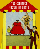
Fun Movies: This thing is actually kind of neat, much better than that pointless "Fun Films" feature. Neat use of the "stage" as a prop, especially with how we get two separate "films" using the same stage. But... what the absolute hell is wrong with the positioning of this? They put this "cut out this bit of the magazine" activity on the other side of a coupon for their own fan club you ALSO need to cut out, meaning you have to pick one of them to cut out and ruin the other in the process. That's just stunning incompetence. Wow!

It's a Fact: Obscure fun facts that are actually pretty fun. Aside from the fact that the kiwi will only eat that which is buried, they seem to be actually true too, according to my googling. Entertaining little page.

Sports: Absolutely fascinating article about the rising popularity of baseball in Japan and a historical game played against American's greats. And it feels mean to mock the writer for not being psychic, but it's hard to not chuckle at how insistently optimistic he is that Japan and America will never go to war against each other because baseball. The wrestling article with its mention of speculation that pro wrestling MAY be fake is amusing in a "wow this is old" way too, but doesn't really say a whole lot beyond that. I'm still surprised at how fun these sports pages are, though.
I have NO idea who those "lost stars" are, and the article doesn't give me any particular reason to care.
Radio: Buck Rogers and Billy Benson again, something tells me they were paid to promote these two shows. The Billy Benson bit is actually a pretty nice description of the show, but I really don't get the point of that long Buck Rogers plot summary. Are they recapping or spoiling things? Not familiar with this "Jolly Bill" person, but the feature on him was interesting enough, probably a fun read for readers that knew who he was.
Movies: I DON'T know the story of West of the Pecos, article man. Wasn't aware of this Dog of Flanders adaptation, seems like they changed the ending. Wonder if they'd have promoted it like this if they hadn't. The Silver Streak actuallly sounds interesting, might check that out. oddly short article compared to the one in issue #1.
Model Aircraft: Much better written than the article in issue #1, actually feels complete and mentions all the stuff that one didn't. Still feels a bit thin though, reads like it's aimed at somewhat experienced modelers who are probably getting better model sheets from other sources. You'd think they'd want to aim these at beginners. It's okay-ish though, I can see this one being used.
Aviation: These historical tech articles are so facinating to read. This one talks about radio navigation, deicing boots and air-to-ground strikers as new and exciting innovations the reader probably haven't heard of. This is great stuff.

Cap'n Erik: Issue #1 hid too much from the reader, but this one makes it clear they're just competitive seal hunters and seemingly nothing more, which isn't too interesting. All this sabotaging is weird, is this some super secret exclusive hunting ground they're fighting over or what? I just can't work up any interest in this one.

Sail Ho: Weird filler. We don't know what Leif Eriksson's ship was called, I have no idea what's up with this "Red Rover" thing. And what's with that weird sail decoration? I'm confused.
Fun In Magic: This is just a math trick that I can't imagine impressing anyone who's heard of math tricks before. Would be more impressive if you had the spectator pick the number of checkers to remove himself. Still not complex enough to not be easily worked out by anyone going through the motions afterwards though.

Captain Spinacker: I'm having trouble understanding the punchlines here. I guess the first one is that the ice froze into "boots" for him so he could walk on water, but that's not very funny, and logically he'd just topple over in those tall waves. He sure wouldn't be able to float. And is the second punchline really just a "look over there" trick? That's not a punchline. This is bad.

Buckskin Jim: Some okay action, but there's no story here, just Jim and Pete getting caught by indians. This is not interesting and not very exciting. Give me a reason to care.

Popular Science: More articles about groundbreaking stuff - Jean Piccard's prototype spacecraft stuff and the discovery of heavy water - back when it was new and exciting. Plus an explanation of barometric light and some weird technology prophesizing by Tesla. Great fun to read.
Stamps and Coins: This goes on and on about how collecting stamps can make you learn about the world by researching the history behind why the stamps were issued, and I can't help but think it's much simpler to just read a book about something you're interested in instead. And the coin section just mentions two new commemorative coins. This just feels like a waste of space, anyone who's actually interested in this stuff is surely reading dedicated magazines, not relying on an supposedly monthly comic book. I get that they're just trying to find out what readers might be interested in, but this page feels like a miss.
Young Homemakers: Party arranging tips, with a focus on invitation writing, party games and even a recipe for tapioca pudding with meringue (which sounds pretty good). Nice little article, much better subject matter than last issue.
Books: The article talks about "exciting stories", yet it presents one handbook, one fact book and one book for very young children who seem too young for this magazine. I think boys craving fun reads would be better off reading the text stories in this magazine.

Sonny: More dumb than funny, but this one made me laugh at the plain bizarreness of it.

Little Linda: I have next to no familiarity with Little Orphan Annie, so I can't tell how big a knockoff this is. Taking it entirely on it own merits, though, I like this one. It's cute and charming, the art is nice, Linda is really likeable and the plot is intriguing. A good addition to the book.

After School: Is that really a cliffhanger? Not a punchline? Works fine a a punchline to me. This one's funny and charming still, best comedy strip in the magazine. I like the dumb argument at the start - "I made the secret sign so you have to obey", "It doesn't count because I had my fingers crossed"... this is TOTALLY how kids are.

The Saurus Family: This is not funny. Is it even trying to be funny? It's just weird and I'm not sure why it exists.

Caveman Capers: Considerable improvement over the strip from the first issue, this one's actually kind of amusing.  The scene with the dinosaur stretching its neck around the tree almost looks like a cartoon storyboard. The addition of backgrounds make it look more appealing than it did in issue #1 too. Where did the rest of the family go though?

Fun Films: This still isn't working, it just feels like a comic strip with way too many unnecessary panels. There's more plot this time, but the rapid shifting between scenes just make the gimmick feel even more pointless. This just fails in every way. Plot couldn't be more generic if it tried.

Jolly Roger: Five panels, one fourth of a page of story, and it's too be continued. What do you even say about this? It's literally just "one day a ship that's on the lookout for pirate ships spotted a pirate ship, to be continued next month". This is so much nothing you don't even remember reading it.

Jumpy and Bunny: Art's okay, but that's one weak punchline. I guess it's going more for cute than funny, but it just feels like a rushjob where the author couldn't think of anything better.

Bubby and Beevil: Uh, last issue ended on a "cliffhanger" while this is just a new unrelated story. The entire "good deed goblin and bad deed goblin" dynamic is completely gone too, now we just have two goblin friends on an adventure. Doesn't even feel like the same strip. As for their adventure this time, there's not a whole lot here, it's to be continued before it really starts. I wasn't the biggest fan of the strip in issue #1, but I'm not sure if this is an improvement.

Pelion and Ossa: Last strip said the one that was coming was flying through the air, can Mr. Walrus fly? This still isn't funny, interesting or charming, and the punchline barely registers as one. Why did Mr. Walrus sit on the sled at the edge of the stairs? This does nothing for me.

Super-Police: THIS got interesting quick. I love the random technobabble and ridiculous plot elements and how they're playing everything mostly straight, while still using that Axel guy as comic relief. The art is great and the plot is getting pretty exciting now that it's started to move, intrigued about this one. I wish they'd give mustache man a name already though.

The book claims to be the "March issue", but the previous one was the February issue and this one is full of editorial references to letters received after its publication. There must've been at least two months, probably three, between them for that to be possible. That's a long time to wait for a single page follow-up to a sunday length strip.
The letter page has a letter from Al Stahl, who would go on to produce comics for them in just half a year or so, THAT'S cool. I'm surprised at how many kids were writing in wanting more text articles and text stories, I always thought of this stuff as early publishers misjudging what readers wanted.
Announcing a fan club in the very second issue is kind of bizarre, especially when they're making such big demands for number of members. At least membership is free outside of all members needing to buy a copy of the mag. I guess this Jolly Bill fellow promoted it on his radio show too.

The editorial wants my top 8 list of favorite comics again. Honestly all these 8 are pretty equal to me now:
1) Barry O'Neill
2) Jack Woods
3) Wing Brady
4) Super-Police
5) Don Drake
6) Little Linda
7) After School
8) Magic Crystal

So yeah, the big issue here is obvious. 1 page per issue in a magazine that seemingly can't even manage to be monthly just doesn't work. I can get that they chose to do this because they hoped to make this a weekly magazine pretty quick, but in its current format it doesn't work. And they should have KNOWN that, at the very least Famous Funnies, the biggest contemporary comic book at the time, generally offered 4 sundays of each of its strips every issue.
Would I have bought this at the time? Yeah, probably, the selling point of "comics you've never read before" is a pretty strong one, and the 8 comics I listed above seem pretty solid. The text articles are mostly decent too, surprisingly enough. But getting a single page a month at best means those action adventure strips are just going to move at a snail's pace, and they make up the majority of the content. Everything being continued serials means missing an issue hurts a lot too.

« Last Edit: March 22, 2021, 11:39:09 PM by Adamanto »
ip icon Logged
Pages: 1 [2] 3
 

Comic Book Plus In-House Image
Mission: Our mission is to present free of charge, and to the widest audience, popular cultural works of the past. These are offered as a contribution to education and lifelong learning. They reflect the attitudes, perspectives, and beliefs of different times. We do not endorse these views, which may contain content offensive to modern users.

Disclaimer: We aim to house only Public Domain content. If you suspect that any of our material may be infringing copyright, please use our contact page to let us know. So we can investigate further. Utilizing our downloadable content, is strictly at your own risk. In no event will we be liable for any loss or damage including without limitation, indirect or consequential loss or damage, or any loss or damage whatsoever arising from loss of data or profits arising out of, or in connection with, the use of this website.