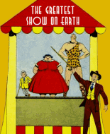
Super Duck #42
The Super Duck stories aren't all that bad. (1) They're more coherent than most funny animal comics of the period. The one that works best is the one that's the most Barksian in structure, "The Pick of the Crop."
(2) The main characters are grating. Uwanna is even more self-centered and needy than Daisy. Supe is entirely unlikable. I get that he's supposed to resemble hot-tempered Donald. However Supe blows his stack much too quickly and (3) I don't recall Donald beating up his nephews when he got mad.
Al Fagaly's artwork is pretty good. (4) I'm not crazy about the panels with the character's disembodied heads against a black background.
(5) One thing bugs me about Super Duck's design: his mouth (or bill or whatever). Much of the time its squared-off and the upper and lower parts are drawn flat. Supe's mouth looks like a mousetrap when it's open and the bill seems to be pasted to his face instead of growing out of it.
(6) Cubby the Bear does nothing for me. The artwork is meh and as has already been pointed out, the feather duster gimmick is bungled because all the dusters in the collection are identical.
In closing, the comic ain't that bad, but 94 issues???!
Thanks for your comments. I agree with all of them. I like Fagaly's artwork, because it reminds me of Barks, and I like the movement and animation-influenced action. He "stole" enough Barks plots and staging, for me to even like READING many of his stories.
(1). As I stated above, I think Fagaly's artwork is like a
"Poor Man's Barks" (a VERY poor man's). But, as far away from Barks' excellence as he was, he was 3-scales better(to my taste) than most of the other "Funny Animal" artists of the time.
(2) I agree that "Supe" is not a sympathetic, or empathetic character - and therefore, not likeable. I also agree that Uwanna (whose name should be: "YouWanna?"), is 50 times more selfish and bitchier than Daisy (who actually displays good, kind, loyal, and even loving qualities, at times). And Fauntleroy gives his older brother back what he gets from him, so, he, too is not really a protagonist. So, the series has a kind of negative feel to it. I'm not sure why Fagaly chose to concentrate ONLY on Barks' characters' BAD traits. That doesn't seem to be a good strategy. But maybe he did that because he (and his editor) felt that IF he gave Supe's little brother and girlfriend well-rounded characters, his series would look much too much like Barks', and Disney would come gunning for MLJ (which happened, anyway). Fagaly also had a "Grandma Duck" who looked and acted EXACTLY like Barks' Donald's Grandma. And he also had a neighbour that hated Supe, and that attitude was mutual. They had "garden Wars" similar to Donald's battles with his neighbour Jones.
(3). I agree that it's tough to find a protagonist in this set of characters with the lead character physically pummeling his little brother (for whom he has custody, and the obligation to raise him and provide for his needs). Of course, we'd never have seen that in a Disney comic book (or film).
(4) I absolutely hate the lazy use of disembodied heads, whether or not there is a panel boundary. That only works for me when used as a chorus of ghosts or spirits of long past ancestors, or famous personages, that are warning the current character, giving him or her advice, or commenting on the story's situation.
(5) Unfortunately, I think the squared-off beak/mouth was implemented after MLJ was warned by Disney's threats, to change Super Duck's appearance enough that he no longer looks like Donald. Supe started out in 1943 looking very like the animation Donald, when Barks' Donald also looked more like that. Here are some examples, including Supe's gradual transformation into his "Super Duck" superhero state, complete with cape:

Dave Higgins and Bill Vigoda also drew a few "Super Duck" front covers and stories, each, in 1943 and very early 1944, and they had a more rounded beak. Fagaly changed to the square beak, probably after a second warning from Disney, after Fagaly started copying almost entire Barks stories, not just in style and basic plots, but also in entire page layouts with virtually the same story. He drew Supe dressing up like a girl to win a kite-flying contest for Faunt's clubhouse gang, which copied most of a Barks 1944 story. As I stated above, most of my favourite Super Duck stories are almost exact clones of Barks stories, or stories pieced together combining 2 or 3 Barks subplots from different stories. It's clear that Fagaly was a much better artist than writer, and having to write and draw a whole book every month, while also producing a "Fauntleroy" book once a year, and taking a foray into trying to develop a new newspaper strip every few years, was too much on his plate to be able to come up with so many new stories. In my opinion, MLJ/ArchieSeries were lucky they never had to shut down the series due to Disney lawsuits.
Supe's beak started becoming squarish in 1948, and got more stiff and square gradually over 1948 and 1949. It didn't actually get perfectly straight-lined in every pose until 1950 or 1951 (and even then, it was mostly the lower beak). I think the squaring off made drawing him faster, because it took less time and care to just draw those straight lines.
(6). I agree that The "Cubby" stories are worthless to anyone over 5 or 6 years old. The artwork is simple, but ugly (and not very much skill needed, at all). The stories are for tots. I wouldn't have enjoyed them even at age 3. I just skipped them.


