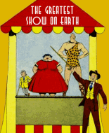
Wilbur Comics 01https://comicbookplus.com/?dlid=73214That cover would certainly have attracted attention on the stand.
It's unusual to have a two-panel gag on the cover.
Going back to something pointed out in many comments here over the years, in a different context,Girls in Red Dresses on covers. Its so prevalent, that I just realized an simple explanation. Red gets your attention, and getting attention is the point of a cover, so at that time, probably part of a cover artist's technique.
Also unusual for depicting a very violent act by a female. It goes over the usual line for slapstick, because that is a very nasty graphic injury. Makes me grimace each time I look at it.
The one-pager. A good artist observes and uses what he sees.
He has it exactly right that teenagers, when they try to sit still and read, keep moving around and end up in al sorts of ridiculous positions. I'd forgotten, but that brings back memories.
But as far as anatomy and general skill, it looks like Bill V. was very much at the beginning of his career.
Welcome To WestfieldPage I - visual gag unrelated to any story. I don't get that car to the right of the sign. Looking at the wheels, It's obviously been dumped there, so why is there a driver?
Makes A DateTurn over the intro page and we get a two page spread intro to the next story and everything we need to know is right there on those pages. Not good art, but good visual story-telling in spite of it.
Signed by both artist and inker/writer.
My feeling about thsi Wilber comic is that they creators were trying out things, still flexible, the character and his environment are not yet fixed. Clearly some of this ended up as part of the Archie mythos.
The Reggie-like practical joker, Wilbur's orange-checked pants,the bow-tie,the older female teacher with grey hair in a bun.
Do You Know?Got the first one wrong, but the rest were obvious. Didn't try to find the mistakes.
The Bus Boy Did girls still do the 'Drop the Handkerchief' routine in the 1940s?
Story is pretty straight-forward slapstick.
ChimpyThere are a lot of visual gags in this one. I have to think they are the property of the script and not the artists imagination, because visually the artist adds nothing and they fall flat.
A Wilbur short.Pretty ordinary slapstick and a very flat ending.
A Fish StoryStraight slapstick again, and Bill is still learning to make it work visually.
Omar Of BagdadCarl Hubble is not currently known for this kind of work. Wonder how much work like this he did?
Carl Hubbellhttps://www.lambiek.net/artists/h/hubbell_carl.htmI quite liked this, had a chuckle in a couple of places,which is more than I got out of the Wilbur stories.
I found myself wondering what happens next, which is always a good sign.
Darn Good Violinist.A Flat ending. Like the music.
cheers!


